Introduction
Swiper, carousel, slider. I bet you've heard one of these before. They can be easily seen in modern websites today. That's because they provide an interactive section for users to swipe or drag through the slide of images or content. In my early days of web development, I used a third-party library to implement it in my web projects. But now I've learned how to build one myself and I would like to share this knowledge on how to build your own swiper in React and TypeScript, as well as write tests for it using Jest and Testing Library.
There's nothing wrong with using a third-party library since it saves us a lot of time but it's also not good to be too dependent on it. Sometimes there are extra features you don't need, it will add unnecessary size to your assets bundle. Sometimes customization options are not enough to achieve the expected design of the component. What if there's no third-party library that can implement the component you need? Do you just wait until someone else builds it for you? Learning how to build your own will not only help you avoid these issues but also give you the knowledge and confidence you may require in the future to extend your swiper component or even build other components.
So if you're interested in learning how to build your own swiper, swipe down (no pun intended)!
Prerequisites
This is the link to the swiper which we'll accomplish by the end of this post, you can see and play around with it or use it as your reference throughout this tutorial.
Upon writing this post, I assume that you have some web development background and basic knowledge regarding npm, yarn, HTML, CSS, JavaScript and React.
Make sure to install Yarn in your system if you haven't. We use Yarn as our package manager, it's just like npm but faster.
I've written a separate post about the IDE and extensions I use to help me save time and energy when writing my code in React. I highly suggest that you check it out if you haven't!
Initialize your project
Fastest way to start a new project with React is using the Create React App. It is an officially supported way to create single-page React applications. It offers a modern build setup with no configuration so you can focus on code, not build tools.
To create our project with React and TypeScript, run this command in your terminal:
yarn create react-app react-typescript-swiper --template typescript
Once project is initiated, install the additional libraries which we'll be using later on:
cd react-typescript-swiper
yarn add @testing-library/react-hooks faker@5.5.3 @types/faker@5.5.9
To run our project, execute the command below:
yarn start
This command will open your default browser and go to http://localhost:3000/. If it doesn't, you can do it yourself too.
This setup comes with live-editing or hot reloading which means when we save file changes, it will automatically update the app and reload on the browser. That's great for local development!
Clean up the project
We're ready to code! Let's clean up our project which was created by Create React App. We won't be needing some of them. Delete or clear the contents of the following below:
- src/App.css (clear contents)
- src/App.test.tsx (delete)
- src/logo.svg (delete)
Then let's update the code of src/App.tsx:
import './App.css';

function App() {
  return <div className="container"></div>;
}

export default App;
We will use the App component as the container of our swiper. Then, add the following code to src/App.css:
.container {
  width: 800px;
  max-width: 100%;
  margin: 0 auto;
  padding: 20px 15px;
}
And update the src/index.css too:
* {
  box-sizing: border-box;
}

body {
  margin: 0;
  font-family: -apple-system, BlinkMacSystemFont, 'Segoe UI', 'Roboto',
    'Oxygen', 'Ubuntu', 'Cantarell', 'Fira Sans', 'Droid Sans',
    'Helvetica Neue', sans-serif;
  -webkit-font-smoothing: antialiased;
  -moz-osx-font-smoothing: grayscale;
}
That's about it. This will be the container of our Swiper component.
Swiper component
Normally, I like to put all my components in a folder called components. Go ahead and create that folder under the src folder. Once you've done that, create src/components/Swiper.tsx and add the following code below:
import React from 'react';

import './Swiper.css';

export default function Swiper() {
  return (
    <div className="swiper-container">
      <ul className="swiper-list"></ul>
    </div>
  );
}
Swiper styles
Let's add some style for our Swiper component by creating src/components/Swiper.css and add the following code below:
.swiper-container {
  width: 100%;
  max-width: 100%;
  overflow: auto;
}

.swiper-list {
  min-width: 100%;
  display: flex;
  flex-direction: row;
  list-style: none;
  padding: 0;
  margin: 0;
}
When you save these changes, you won't be seeing anything in our web application but a blank page. Don't worry, you'll get to see something very soon! For now, we'll just code it all first. Let's continue.
SwiperItem component
Since our Swiper component is like a gallery of images we need a separate component for each image and we can name it SwiperItem component. Create a file src/components/SwiperItem.tsx and add the following code below:
import React from 'react';

import './SwiperItem.css';

function SwiperItem() {
  return (
    <li className="swiper-item">
      <img src="" alt="" className="swiper-img" />
    </li>
  );
}

export default SwiperItem;
And let's add the styles for it in src/components/SwiperItem.css:
.swiper-item {
  width: 100%;
  flex-shrink: 0;
}

.swiper-img {
  width: 100%;
  height: auto;
  user-select: none;
}
Alright, currently our SwiperItem component is not reusable to display different images, how do you make a component reusable? Through component props! For this tutorial, we just need the source URL of the image and an alternative text for each item. Both values are required and should be string. For those new to TypeScript, this will be your first encounter with the syntax, I'll be explaining it in a bit. Let's update src/components/SwiperItem.tsx first with the codes below:
import React from 'react';

import './SwiperItem.css';

function SwiperItem({
  imageSrc,
  imageAlt,
}: {
  imageSrc: string;
  imageAlt: string;
}) {
  return (
    <li className="swiper-item">
      <img src={imageSrc} alt={imageAlt} className="swiper-img" />
    </li>
  );
}

export default SwiperItem;
Ok, if you're new to TypeScript, this is how we can create a type for our props (or any object). If we try to use our SwiperItem component without passing any props, TypeScript would throw an error. Because we defined the type of the fields in our props to be required. Same thing would happen if you try to pass another type which is not a string. Let's say you pass a type of a number, that would also throw an error. You can already see how helpful TypeScript is in catching potential issues early on.
You might ask, how do we define an optional field? You can do that by adding a question mark before the : like this:
{
  imageSrc?: string;
  imageAlt?: string;
}
Alright, we're not done yet. I already foresee that we would be reusing the same type in our Swiper component. So what I normally like to do is place reusable types in a single file. Let's go ahead and do that.
Create the type
Create src/types.ts. This will be the place where we could put shared types across components to reduce code duplication, although for this guide, we are only going to add one type, that would be the SwiperItemType. So update the file with the following code:
export type SwiperItemType = {
  imageSrc: string;
  imageAlt: string;
};
This is how we can declare a type (or type aliases) and make it reusable by exporting it.
Now go back to SwiperItem component and update the code to use the type alias we just created:
import React from 'react';
import { SwiperItemType } from '../types';

import './SwiperItem.css';

// exported so we can use later in tests
export type Props = SwiperItemType;

function SwiperItem({ imageSrc, imageAlt }: Props) {
  return (
    <li className="swiper-item">
      <img src={imageSrc} alt={imageAlt} className="swiper-img" />
    </li>
  );
}

export default SwiperItem;
Swiper + SwiperItem component
We can now use the SwiperItem component in our Swiper component. Since our Swiper component would be the main component that will be reused across our React application. It needs to accept a prop that is an array of swiper items. Remember we already created the type for that, we just need to wrap it in an Array to tell TypeScript that the field accepts an array of SwiperItemType. You can see the code below on how to do that, simply update our Swiper component with this:
import React from 'react';
import { SwiperItemType } from '../types';
import SwiperItem from './SwiperItem';

import './Swiper.css';

// exported so we can use later in tests
export type Props = {
  items: Array<SwiperItemType>;
};

function Swiper({ items }: Props) {
  return (
    <div className="swiper-container">
      <ul className="swiper-list">
        {items.map((item, idx) => (
          <SwiperItem key={idx} {...item} />
        ))}
      </ul>
    </div>
  );
}

export default Swiper;
Sample data
We're almost there to see something in our browser. We would need some sample data. I found some images we could use from MDN Web Docs. I don't own these images and I hope they don't mind if we use them for this tutorial, all credits goes to them. Please open the images below in another tab and download them:
After you've downloaded them all, put them in the public folder of your React project.
Then let's update our App component with the code below:
import './App.css';
import Swiper from './components/Swiper';

function App() {
  const items = [
    {
      imageSrc: '/pic1.jpeg',
      imageAlt: "A person's eye",
    },
    {
      imageSrc: '/pic2.jpeg',
      imageAlt: 'A rock formation',
    },
    {
      imageSrc: '/pic3.jpeg',
      imageAlt: 'Some flowers',
    },
    {
      imageSrc: '/pic4.jpeg',
      imageAlt: 'An egyptian wall painting',
    },
    {
      imageSrc: '/pic5.jpeg',
      imageAlt: 'A butterfly on a leaf',
    },
  ];

  return (
    <div className="container">
      <Swiper items={items} />
    </div>
  );
}

export default App;
Once you save the changes, you should see something like this:
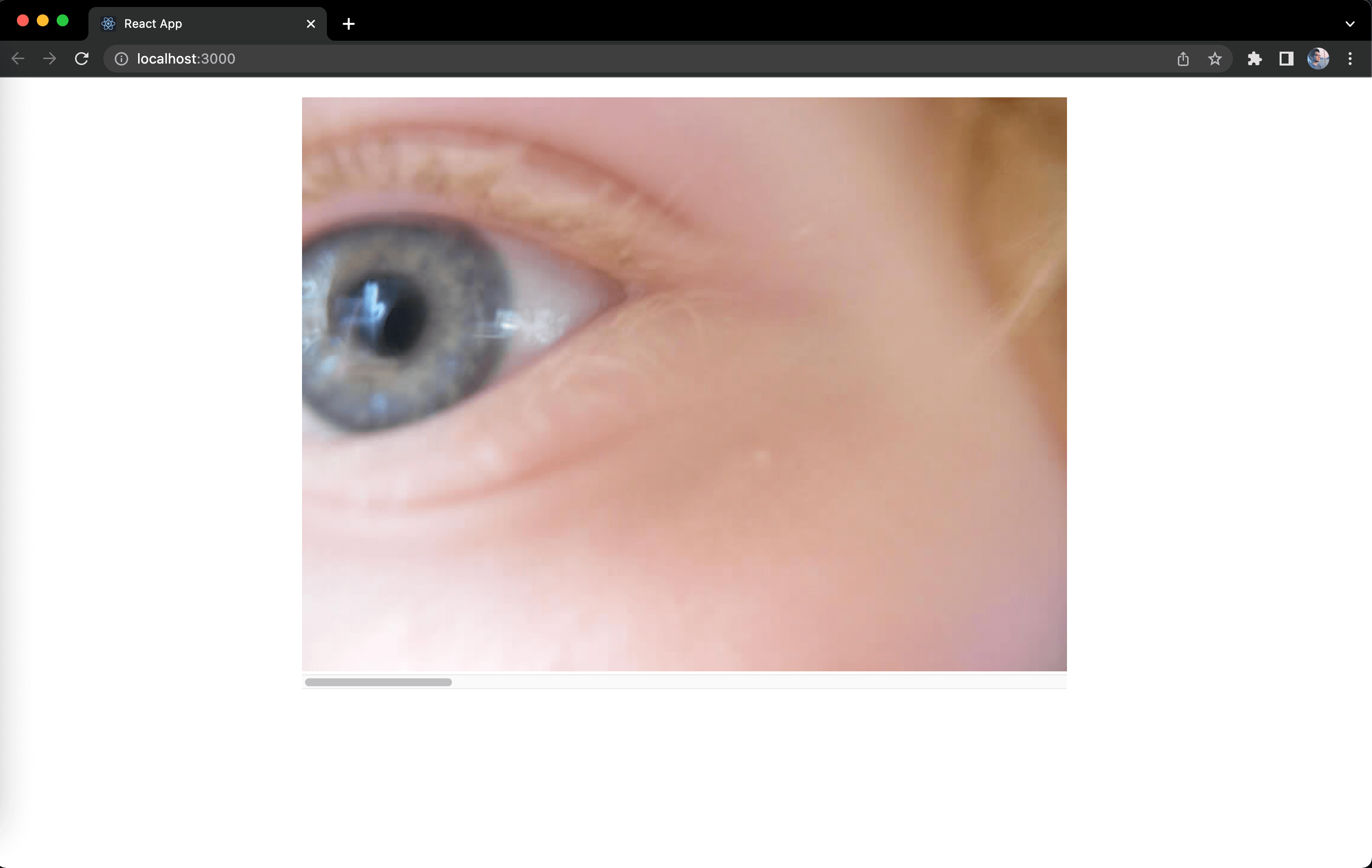
I know, there's a creepy eye looking at us! But on the bright side, that's when we know everything is working fine as expected. You could also see that there's a scroll bar below the image, you can scroll to see the other images. For the next steps, this scroll bar should be hidden and we should be able to swipe through our gallery of images by doing a drag action in desktop or swipe in mobile. So let's continue!
Touch/Drag logic
Before we proceed to coding, I want to explain what we want to accomplish so you get a better grasp of what is being coded and why the logic is like this. To better explain it, let's do it in a step-by-step way:
| # | User actions | Swiper logic |
|---|---|---|
| 1 | User sees the Swiper | First image is displayed |
| 2 | User clicks/touches the swiper | Position of click/touch is recorded as starting position |
| 3 | User holds and drags/swipes from right to left | Difference between starting position and current position calculated to move image along with the user action |
| 4 | User lets go of drag/swipe | New image is displayed depending on nearest position |
Alright, I hope with this you get an understanding of what code we need to add in our Swiper component.
To start, let's make a minor update of the style of our Swiper component to hide the scroll bar. We won't be needing it. Go to src/components/Swiper.css and update with the following code:
.swiper-container {
  ...
  overflow: hidden;
  touch-action: pan-y; /* prevent browser's default behavior on swiping horizontally */
}
In web browsers, there's this behavior that you can drag a link or an image to open it in a new tab, this will affect our touch/drag logic, so in order to prevent that, let's also make a minor code update in our src/components/SwiperItem.tsx:
...

function SwiperItem({ imageSrc, imageAlt }: SwiperItemType) {
  return (
    <li className="swiper-item">
      <img
        ...
        draggable={false}
      />
    </li>
  );
}

...
Next, let's create src/lib/hooks.ts and create a couple of hooks utility functions:
import { useRef, useState, RefObject } from 'react';

// to get the value of a ref from `useRef`
export function getRefValue<C>(ref: RefObject<C>) {
  return ref.current as C;
}

// extension of `useState` to be able to access the state as a ref
export function useStateRef<S>(
  defaultValue: S
): [S, (value: S) => void, RefObject<S>] {
  const ref = useRef<S>(defaultValue);
  const [state, _setState] = useState<S>(defaultValue);
  const setState = (value: S) => {
    _setState(value);
    ref.current = value;
  };

  return [state, setState, ref];
}
I use these utility functions a lot in my projects and it is extremely helpful when writing tests to achieve 100% coverage, especially those components that use RefObject for elements. If you're new to TypeScript, you might be wondering what is this C or S around the code? It can be any letter by the way or word if you would like, and it is called Generics, it makes our utility function here accept the type defined when the RefObject or the state is passed because it can have any type. Using Generics, our function here would be able to return the same type.
// let's say we set the initial value with a type of `number` in `useRef`
const numberRef = useRef(0);

// when we use `getRefValue` to get the value of the ref
// TypeScript would then assume this would return a type of `number`
getRefValue(numberRef);
Finally, go to src/components/Swiper.tsx and let's try to think how can we move the images the way we did when there was a scroll bar. If you guessed it right, we can use a transform function in CSS to move the parent element of the images. We can use translateX or translate3d. Let's use translate3d instead because I've seen popular swiper libraries often use it for better performance. We need to store the value required for translate3d as a state. Let's call this value as offsetX. Let's use useStateRef for that instead of useState because we need to access the state value as a ref in one of our event listeners later on.
...
import { useStateRef } from '../lib/hooks';

...

function Swiper({ items }: Props) {
  const [offsetX, setOffsetX, offsetXRef] = useStateRef(0);

  return (
    <div className="swiper-container">
      <ul
        className="swiper-list"
        style={{ transform: `translate3d(${offsetX}px, 0, 0)` }}
      >
        {items.map((item, idx) => (
          <SwiperItem key={idx} {...item} />
        ))}
      </ul>
    </div>
  );
}

...
0 would be the default value for our offsetX state and that will display the first image. Try replacing 0 with a negative value (e.g. -800), if you're in a desktop viewport, it should display the second image. This is how we're going to move the images in a reactive way.
Normally, I develop features or logic in a mobile-first approach but I thought it would be easier to code and explain to you if we cover the mouse events first. Let's create the first mouse event, onMouseDown which is triggered when you click on the element that is listening to that event. Let's update src/components/Swiper.tsx with the code below:
...

function Swiper({ items }: Props) {
  ...

  const onMouseDown = (e: React.MouseEvent<HTMLDivElement>) => {};

  return (
    <div className="swiper-container" onMouseDown={onMouseDown}>
      ...
    </div>
  );
}

...
If you're new to TypeScript, you would need to define the type of e (or event data). Since we attached the onMouseDown listener in a reactive way, it receives custom event data from React. So instead of simply using MouseEvent as the type of e, we need to use React.MouseEvent which accepts an argument of what type of Element do we expect, in this case we expect it to be an HTMLDivElement.
Alright, inside the listener, what we can do is save the current offset x. We already have offsetX, so why do we need a separate storage for the current offset x? That's because we're using offsetX to move the images, if it's going to be changed on every mouse move event, we will lose track of what was the original offset x value on mouse down. We need the original offset x so we could deduct it with the difference of starting x position and moving x position, in order to create the effect where the images follow our mouse cursor. Let's call this current offset x as currentOffsetX and we can store it in useRef so it could be accessed by other event listeners later on. To write this in code, it would be like this:
...
import { getRefValue, useStateRef } from '../lib/hooks';

...

function Swiper({ items }: Props) {
  const currentOffsetXRef = useRef(0);
  const [offsetX, setOffsetX, offsetXRef] = useStateRef(0);

  const onMouseDown = (e: React.MouseEvent<HTMLDivElement>) => {
    currentOffsetXRef.current = getRefValue(offsetXRef);
  };

  ...
}

...
In our onMouseDown function, we can also save the starting x position returned from the event data. Let's name it startX and we could use this value later to calculate the offset required for the images to follow our mouse cursor. Update src/components/Swiper.tsx with the following code below:
...

function Swiper({ items }: Props) {
  const currentOffsetXRef = useRef(0);
  const startXRef = useRef(0);
  const [offsetX, setOffsetX, offsetXRef] = useStateRef(0);

  const onMouseDown = (e: React.MouseEvent<HTMLDivElement>) => {
    currentOffsetXRef.current = getRefValue(offsetXRef);
    startXRef.current = e.clientX;
  };

  ...
}

...
We can now create the two other mouse event listeners, namely onMouseMove and onMouseUp. The sequence of a dragging using your mouse is like this:
START -> onMouseDown -> onMouseMove -> onMouseUp -> END
So we only need to listen to these two events when the user triggers onMouseDown. We can start listening to these two other events inside onMouseDown. Update src/components/Swiper.tsx with the following code below:
...

function Swiper({ items }: Props) {
  ...

  const onMouseMove = (e: MouseEvent) => {};
  const onMouseUp = () => {
    window.removeEventListener('mouseup', onMouseUp);
    window.removeEventListener('mousemove', onMouseMove);
  };
  const onMouseDown = (e: React.MouseEvent<HTMLDivElement>) => {
    ...

    window.addEventListener('mousemove', onMouseMove);
    window.addEventListener('mouseup', onMouseUp);
  };

  ...
}

...
We attached these two events in the window so that even if the mouse cursor goes out of the list element, it will still continue to fire both the mouse move and mouse up event. You would also notice the type of e from onMouseMove is using just the MouseEvent which is not from React, you don't have to import it from anywhere, it can be used as is. We also didn't have to define e from onMouseUp because we just need it to remove the event listeners once it is triggered and don't need anything from the event data.
Now, let's then add the code inside onMouseMove, here it is:
...

function Swiper({ items }: Props) {
  ...

  const onMouseMove = (e: MouseEvent) => {
    const currentX = e.clientX;
    const diff = getRefValue(startXRef) - currentX;
    const newOffsetX = getRefValue(currentOffsetXRef) - diff;

    setOffsetX(newOffsetX);
  };

  ...
}

...
Here, we took the x position from the event data and named it currentX. We then calculated the difference between the startX and the currentX, this difference is then subtracted from currentOffsetX. The final difference will then be the new value for offsetX.
Once all of the changes are done, you should be able to drag using your mouse to move the container of images horizontally. Isn't that great? I think yes!
To apply the same logic for mobile. Create a file src/lib/dom.ts and add the following code:
import React from 'react';

export function getTouchEventData(
  e:
    | TouchEvent
    | MouseEvent
    | React.TouchEvent<HTMLElement>
    | React.MouseEvent<HTMLElement>
) {
  return 'changedTouches' in e ? e.changedTouches[0] : e;
}
I created this helper function because in touch events, it doesn't return the clientX in the event data, it is stored in the changedTouches array. So if changedTouches exists in the event data, then we should get the clientX value from the first element of it. If you're new to TypeScript, we could use pipe | to do like an OR condition, so what we did here is basically defined the type of the argument e such that it can be a TouchEvent or a MouseEvent which are for events we attach using .addEventListener(). It could also be a React.TouchEvent<HTMLElement> or a React.MouseEvent<HTMlElement> which are event listeners we attach in an element as an attribute (e.g. onTouchStart, onMouseDown, etc.).
Alright, let's do some renaming in src/components/Swiper.tsx for a mobile-first approach and make use of this new helper function:
...
import { getTouchEventData } from '../lib/dom';

...

function Swiper({ items }: Props) {
  ...

  const onTouchMove = (e: TouchEvent | MouseEvent) => {
    const currentX = getTouchEventData(e).clientX;

    ...
  };
  const onTouchEnd = () => {
    window.removeEventListener('touchend', onTouchEnd);
    window.removeEventListener('touchmove', onTouchMove);
    window.removeEventListener('mouseup', onTouchEnd);
    window.removeEventListener('mousemove', onTouchMove);
  };
  const onTouchStart = (
    e: React.TouchEvent<HTMLDivElement> | React.MouseEvent<HTMLDivElement>
  ) => {
    ...
    window.addEventListener('touchmove', onTouchMove);
    window.addEventListener('touchend', onTouchEnd);
    window.addEventListener('mousemove', onTouchMove);
    window.addEventListener('mouseup', onTouchEnd);
  };

  return (
    <div
      className="swiper-container"
      onTouchStart={onTouchStart}
      onMouseDown={onTouchStart}
    >
      ...
    </div>
  );
}

...
If you try dragging using your mouse, it should still work like before. If your browser supports the device toolbar, you can verify that using touch would also work. This is how it looks like when using the device toolbar in Google Chrome:
Okay, we're not done yet though. You might have already noticed it while testing. When you swipe or drag too far away from the first image or last image, you'll see nothing. For user experience, that's not really great. We should prevent that.
Prevent swiping on both ends
To fix the problem, we need to understand the problem. We already know that we use offsetX to move the container of the image, and that it shouldn't move beyond the images. So we need to know the value of the far most left offsetX value and the far most right offsetX value. The far most left is easy, we start with 0 for offsetX to display the first image, there's no image before the first image, so that is already the first end. So what is the far most right offsetX value? That would be the width of the container. Let's name the far most left offsetX value to be maxOffsetX while the far most right offsetX value to be minOffsetX.
To get into coding, let's declare the useRef for the container element in /src/components/Swiper.tsx so we could get its offsetWidth:
...

function Swiper({ items }: Props) {
  const containerRef = useRef<HTMLUListElement>(null);

  ...

  return (
    <div
      className="swiper-container"
      ...
    >
      <ul
        ref={containerRef}
        ...
      >
        ...
      </ul>
    </div>
  );
}

...
If you're new to TypeScript, this is how we declare a ref for an element, we provide the element type and use null as initial value. TypeScript expects you to give this ref to an element's ref prop or attribute.
Next, let's calculate the minOffsetX on mouse down event so we don't have to keep calculating it during mouse move because that would be inefficient. Let's update our src/components/Swiper.tsx:
...

function Swiper({ items }: Props) {
  ...
  const minOffsetXRef = useRef(0);

  ...

  const onTouchStart = (
    e: React.TouchEvent<HTMLDivElement> | React.MouseEvent<HTMLDivElement>
  ) => {
    ...

    const containerEl = getRefValue(containerRef);

    minOffsetXRef.current = containerEl.offsetWidth - containerEl.scrollWidth;

    ...
  };

  ...
}

...
Just in case you're wondering how we came up with this calculation. We needed to get the entire width of all the images together and that value would be the container's scrollWidth. Since we start from 0 to display the first image, to display the image it would not be a negative value of scrollWidth, we need to deduct the display size of the container on to it. And in case you forget, we need a negative value to move the images from right to the left.
Alright, now that we know maxOffsetX is 0 and we already computed minOffsetX on mouse down. Let's add some if conditions to prevent swiping from either end. Simple update src/components/Swiper.tsx with the following code:
...

function Swiper({ items }: Props) {
  ...

  const onTouchMove = (e: TouchEvent | MouseEvent) => {
    ...
    let newOffsetX = getRefValue(currentOffsetXRef) - diff;

    const maxOffsetX = 0;
    const minOffsetX = getRefValue(minOffsetXRef);

    if (newOffsetX > maxOffsetX) {
      newOffsetX = maxOffsetX;
    }

    if (newOffsetX < minOffsetX) {
      newOffsetX = minOffsetX;
    }

    setOffsetX(newOffsetX);
  };

  ...
}

...
After saving the changes, you can go back and try swiping through your swiper and you wouldn't be able to swipe if you are at either both ends. Cool!
Next thing we need to solve is the difficulty in swiping through the images, our Swiper component should be able to let us swipe easily to the next image and place the next image in display properly because we want our users to do less swiping and also let them view each images in full, not in split view.
Auto swipe to nearest image
To swipe images exactly in their position, we need to understand each offsetX value to display the images. Let's say in a large screen resolution, our container width would be 800px. We know that offsetX starts with 0px which displays the first image. To display the second image, you would need the offsetX to be 800px which is the same as the container width. To display the third image, you would need the offsetX to be 1600px which is twice the container width. And we just keep multiplying the container width until we reach the last image. With this, we can basically say that it's always the multiples of the container width because our images take up 100% of the container which is what we have defined in the CSS style.
So the logic we need to do is basically when the user stops dragging/swiping (onMouseUp event listener), our logic should swipe it to the nearest image. How do we get the nearest image? We can round off the last offsetX position to the nearest multiples of the container width. We can use Math.round and the formula for rounding to the nearest multiple of a number (in this case the containerWidth) is like this:
Math.round(offsetX / containerWidth) * containerWidth;

// for example, we want to round off to the nearest multiples of `5`
// result would be 0, 5, 10, 15, and so on ...
Math.round(1 / 5) * 5; // 0
Math.round(2 / 5) * 5; // 0
Math.round(4 / 5) * 5; // 5
Math.round(5 / 5) * 5; // 5
Math.round(8 / 5) * 5; // 10
Let's use this formula and update the code for src/container/Swiper.tsx:
...

function Swiper({ items }: Props) {
  ...

  const onTouchEnd = () => {
    const containerWidth = getRefValue(containerWidthRef);
    let newOffsetX = getRefValue(offsetXRef);
    newOffsetX = Math.round(newOffsetX / containerWidth) * containerWidth;

    setOffsetX(newOffsetX);

    ...
  };

  ...
}

...
Now try dragging/swiping through the images and let go, it should show the nearest image within the container properly. What I meant by properly here is that the position is just nice to display you the image in full.
It's a little bit abrupt right now. So let's try adding some CSS transitions so this logic will look more sleek. Go to src/container/Swiper.css and update the code with this:
/* ... */

.swiper-list {
  ...
  transition: transform 0.3s ease-out;
}

.swiper-list.is-swiping {
  transition: none;
}
Alright, and let's update src/container/Swiper.tsx to make use of this transition style:
import React, { useState, useRef } from 'react';

...

function Swiper({ items }: Props) {
  ...

  const [isSwiping, setIsSwiping] = useState(false);

  ...

  const onTouchEnd = () => {
    ...

    setIsSwiping(false);
    setOffsetX(newOffsetX);

    ...
  };
  const onTouchStart = (
    e: React.TouchEvent<HTMLDivElement> | React.MouseEvent<HTMLDivElement>
  ) => {
    setIsSwiping(true);

    ...
  };

  return (
    <div
      className="swiper-container"
      ...
    >
      <ul
        ref={containerRef}
        className={`swiper-list ${isSwiping ? 'is-swiping' : ''}`}
        ...
      >
        ...
      </ul>
    </div>
  );
}

...
Go try it out! Awesome! It should work as expected.
We use Math.round which rounds to the nearest image, this can be quite difficult to drag more than half of the current image width just to move to the next image. What if our users just do a lazy swipe or drag, it will not move to the next image at all. That can be quite frustrating for them.
So how can we improve that? First, let's define a minimum difference needed to move to the next or previous image. We'll name this MIN_SWIPE_REQUIRED and set the value as 40, I think that's enough but feel free to configure this later. On mouse up event, we can check if the difference between currentOffsetX and offsetX is more than MIN_SWIPE_REQUIRED then we move the images.
In case you may ask how do we know whether to move to the left or to the right? It would be the sign of the difference. If the difference is positive, we move the images to the right. If the difference is negative, we move the images to the left. We can reuse the same calculation and simply replace Math.round to either Math.floor and Math.ceil to get the offsetX required for the next or previous image.
To write all of these in code, let's update src/components/Swiper.tsx:
...

const MIN_SWIPE_REQUIRED = 40;

function Swiper({ items }: Props) {
  ...

  const onTouchEnd = () => {
    const currentOffsetX = getRefValue(currentOffsetXRef);
    const containerWidth = getRefValue(containerWidthRef);
    let newOffsetX = getRefValue(offsetXRef);

    const diff = currentOffsetX - newOffsetX;

    // we need to check difference in absolute/positive value (if diff is more than 40px)
    if (Math.abs(diff) > MIN_SWIPE_REQUIRED) {
      if (diff > 0) {
        // swipe to the right if diff is positive
        newOffsetX = Math.floor(newOffsetX / containerWidth) * containerWidth;
      } else {
        // swipe to the left if diff is negative
        newOffsetX = Math.ceil(newOffsetX / containerWidth) * containerWidth;
      }
    } else {
      // remain in the current image
      newOffsetX = Math.round(newOffsetX / containerWidth) * containerWidth;
    }

    setIsSwiping(false);
    setOffsetX(newOffsetX);

    ...
  };

...
I hope that wasn't too difficult to understand. Once you save all the changes, try doing a lazy swipe or drag (at least 40 pixel difference!) and see how our swiper will swipe it to the next or previous image.
Swiper indicators
Okay, before we wrap this up. There's one more feature I want to add to our swiper. We can have an indicator to let our users know how many images are in the swiper for them to see and what position the image they're currently looking at. This can also give users an option to click on the indicators to move around the images.
The number of indicators we need is simply just how many images we have. We can simply loop the images again to display the indicators. Once we loop them through using Array.map() which is how you loop an array to be displayed in React, we can get their index. We can create a state that stores the current index (currentIdx) that determines which image is currently displayed.
For setting the new currentIdx after the user does a swipe or drag (on mouse up), we can simply divide the offsetX with the containerWidth, do note that offsetX becomes a negative value when moving to the left so we need to use Math.abs. For moving the images when we click on an indicator, we can multiply the index and the containerWidth and make it negative (to move images to the left).
Let's update src/components/Swiper.tsx with the following code below to add in the indicators:
...

function Swiper({ items }: Props) {
  ...
  const [currentIdx, setCurrentIdx] = useState(0);

  ...

  const onTouchEnd = () => {
    ...
    setOffsetX(newOffsetX);
    setCurrentIdx(Math.abs(newOffsetX / containerWidth));

    ...
  };

  ...

  const indicatorOnClick = (idx: number) => {
    const containerEl = getRefValue(containerRef);
    const containerWidth = containerEl.offsetWidth;

    setCurrentIdx(idx);
    setOffsetX(-(containerWidth * idx));
  };

  return (
    <div
      className="swiper-container"
      ...
    >
      <ul
        ref={containerRef}
        ...
      >
        ...
      </ul>
      <ul className="swiper-indicator">
        {items.map((_item, idx) => (
          <li
            key={idx}
            className={`swiper-indicator-item ${
              currentIdx === idx ? 'active' : ''
            }`}
            data-testid="indicator" // we'll use this later on our test
            onClick={() => indicatorOnClick(idx)}
          />
        ))}
      </ul>
    </div>
  );
}

...
Then update src/components/Swiper.css to add the styles for our indicators:
/* ... */

.swiper-indicator {
  display: flex;
  justify-content: center;
  list-style: none;
  margin: 15px 0 0 0;
  padding: 0;
}

.swiper-indicator-item {
  width: 12px;
  height: 12px;
  margin: 0 4px;
  border-radius: 50%;
  background-color: #cccccc;
  cursor: pointer;
}

.swiper-indicator-item.active {
  background-color: #777777;
}
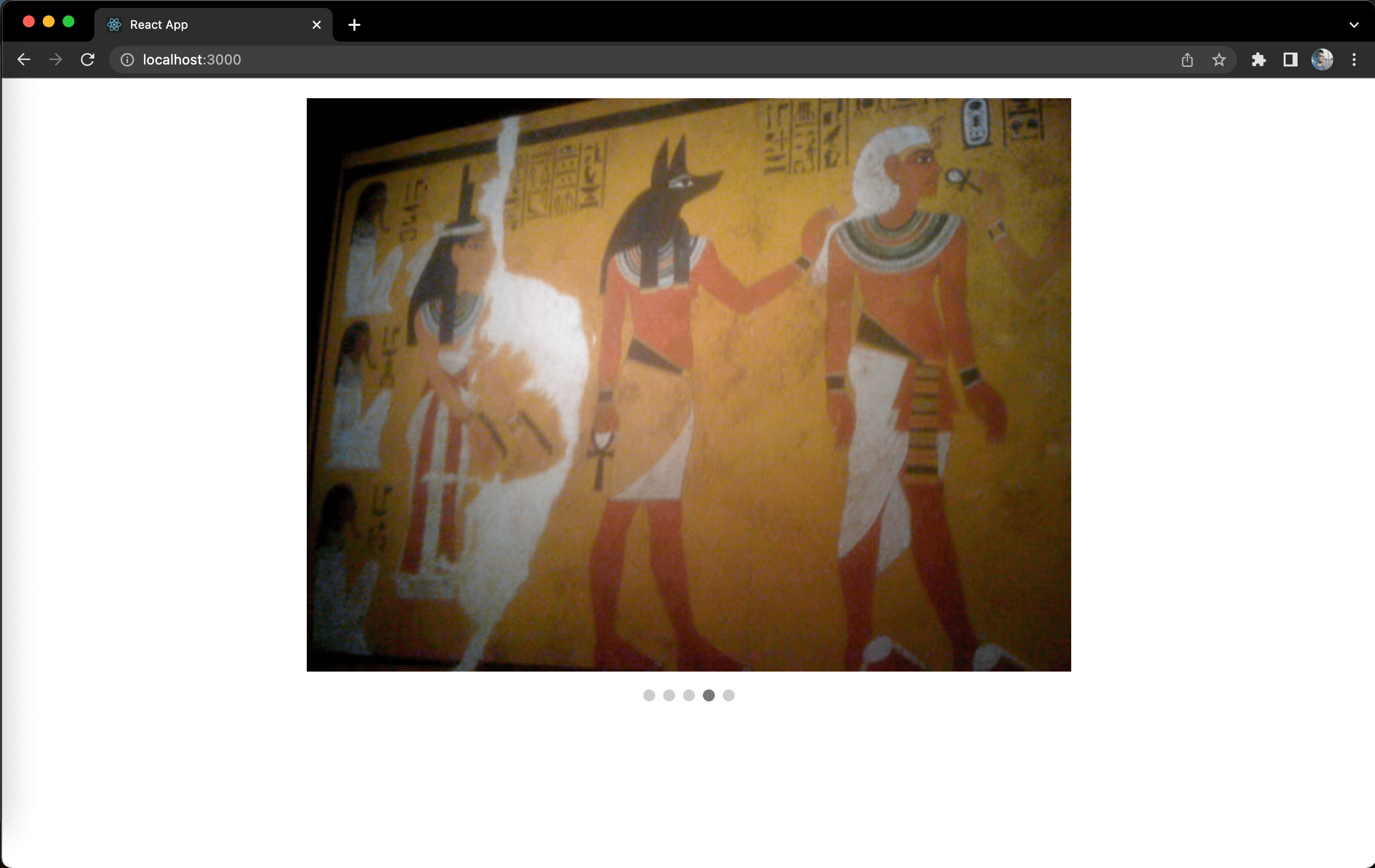
Once you save the changes, should be able to see the swiper with the indicator:
Awesome. Give yourself a pat in the back because you've just built your own swiper!
Time to write some tests!
Proceed to the next part.