Introduction
There's tons of OTP (one-time password) or OTC (one-time code) input I have seen out there, but most of them were difficult to use or didn't give me a great user experience. For example, when I get a prompt with an OTP input on mobile that only accepts digits, once I focus on it, the mobile keyboard should only display numbers but for some web applications they display the alphabet keyboard. Another example is that if I receive an SMS message containing the one-time code I need to fill in, my phone should be able to automatically fill in or suggest the passcodes for the input but again some web apps don't follow the proper implementation. Do you want more examples? If the OTP input is implemented in separate input boxes where only one digit per input box is allowed, when I type in the digit, it should automatically focus on the next input and yet again some web apps aren't able to do that! Yes, you can tell I'm a little bit frustrated that I had to do this post. My solution here may not be perfect but I hope it still helps web developers out there to know what are the considerations and best practices when implementing the OTP input. Although, this post could be much shorter if we just implement the OTP input in one input box, but where's the challenge in that if we don't implement them in separate input boxes, right? So without further ado, let's get on with it ~
Prerequisites
This is the link to the OTP input which we'll accomplish by the end of this post, you can see and play around with it or use it as your reference throughout this tutorial.
Upon writing this post, I assume that you have some web development background and basic knowledge regarding npm, yarn, HTML, CSS, JavaScript and React.
Make sure to install Yarn in your system if you haven't. We use Yarn as our package manager, it's just like npm but faster.
I've written a separate post about the IDE and extensions I use to help me save time and energy when writing my code in React. I highly suggest that you check it out if you haven't!
Initialize your project
Fastest way to start a new project with React is using the Create React App. It is an officially supported way to create single-page React applications. It offers a modern build setup with no configuration so you can focus on code, not build tools.
To create our project with React and TypeScript, run this command in your terminal:
yarn create react-app react-typescript-otp-input --template typescript
Once project is initiated, we can run our project by executing the command below:
cd react-typescript-otp-input
yarn start
This command will open your default browser and go to http://localhost:3000/. If it doesn't, you can do it yourself too.
This setup comes with live-editing or hot reloading which means when we save file changes, it will automatically update the app and reload on the browser. That's great for local development!
Clean up the project
We're ready to code! Let's clean up our project which was created by Create React App. We won't be needing some of them. Delete or clear the contents of the following below:
- src/App.css (clear contents)
- src/App.test.tsx (delete)
- src/logo.svg (delete)
Then let's update the code of src/App.tsx:
import './App.css';

export default function App() {
  return (
    <div className="container">
      <h1>React TypeScript OTP Input</h1>
    </div>
  );
}
We will use the App component as the container of our OTP input. Then, add the following code to src/App.css:
.container {
  width: 100%;
  max-width: 800px;
  margin: 0 auto;
  padding: 20px 15px;
}
And update the src/index.css too:
* {
  box-sizing: border-box;
}

body {
  margin: 0;
  font-family: -apple-system, BlinkMacSystemFont, 'Segoe UI', 'Roboto',
    'Oxygen', 'Ubuntu', 'Cantarell', 'Fira Sans', 'Droid Sans',
    'Helvetica Neue', sans-serif;
  -webkit-font-smoothing: antialiased;
  -moz-osx-font-smoothing: grayscale;
}
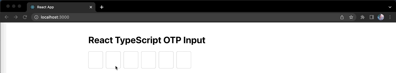
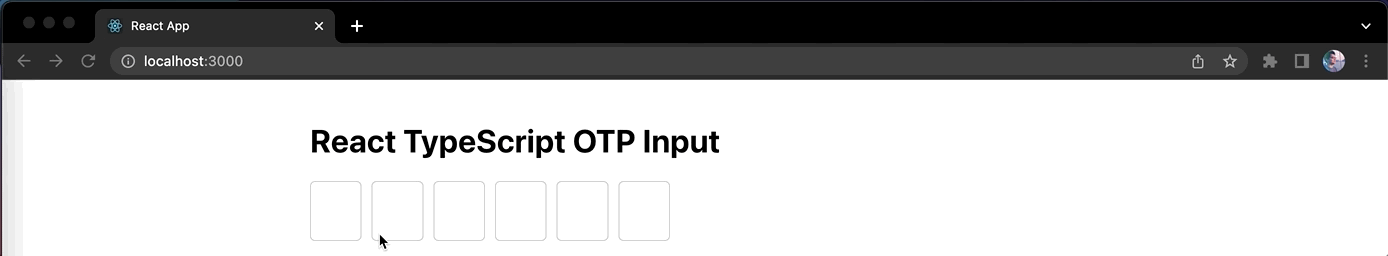
That's about it. This will be the container of our OTP input component.
OtpInput component
Now let's create our component src/components/OtpInput.tsx and add the following code:
import './OtpInput.css';

export type Props = {
  value: string;
  valueLength: number;
  onChange: (value: string) => void;
};

export default function OtpInput({ value, valueLength, onChange }: Props) {
  return (
    <div className="otp-group">
      {[1, 2, 3, 4, 5, 6].map((digit, idx) => (
        <input
          key={idx}
          type="text"
          inputMode="numeric"
          autoComplete="one-time-code"
          pattern="\d{1}"
          maxLength={valueLength}
          className="otp-input"
          value={digit}
        />
      ))}
    </div>
  );
}
So in the code, we allow properties (props) for our OtpInput component to make it reusable. Since we're writing our React code in TypeScript, we initialized the type Props which an object containing value prop that is a string for the one-time code, valueLength prop that is a number for the length of the code (it determines the number of one-digit input boxes to create or display) and an event listener prop onChange to listen to the changes in one-time code so any parent component such as the App component can update the state with the new value.
We hardcoded the array [1, 2, 3, 4, 5, 6] so we can loop through it and display 6 input boxes to make our OTP input. Don't worry about it for now, this is temporary and we'll be replacing it later with our logic to make it dynamic depending on the valueLength prop.
Since OTPs are usually five or six digit numbers, using type="number" for an input field might seem intuitive because it changes the mobile keyboard to numbers only. This is not recommended because the browser expects an input field to be a countable number rather than a sequence of multiple numbers, which can cause unexpected behavior. Using type="number" causes up and down buttons to be displayed beside the input field; pressing these buttons increments or decrements the number and may remove preceding zeros.
So we use type="text" instead. This won't turn the mobile keyboard into numbers only, but that is fine because the next tip for using inputMode="numeric" does that job. inputMode="numeric" changes the mobile keyboard to numbers only.
Some websites use type="tel" for OTP input fields since it also turns the mobile keyboard to numbers only (including * and #) when focused. This hack was used in the past when inputMode="numeric" wasn't widely supported. Since Firefox started supporting inputMode="numeric", there's no need to use the semantically incorrect type="tel" hack.
With autocomplete="one-time-code" whenever a user receives an SMS message while a form is open, the operating system will parse the OTP in the SMS heuristically and the keyboard will suggest the OTP for the user to enter. It works only on Safari 12 and later on iOS, iPadOS, and macOS, but we strongly recommend using it, because it is an easy way to improve the SMS OTP experience on those platforms.
autocomplete="one-time-code" improves the user experience, but there's more you can do by ensuring that the SMS message complies with the origin-bound message format.
While the pattern="\d{1}" specifies the format that the entered OTP must match which in this case constrains the OTP to a one digit string.
And lastly, maxLength={valueLength} to only restrict maximum digits per input box. You might wonder, why not just use one 1 as the value for maxLength. That's because we will allow pasting of code and at the same time allow the autocomplete logic to work. You'll get to see this making more sense later - keep those doubts to yourself for now.
OtpInput styles
Now let's style our OtpInput component by adding the following code in src/components/OtpInput.css:
.otp-group {
  display: flex;
  width: 100%;
  max-width: 360px;
  column-gap: 10px;
}

.otp-input {
  width: 100%;
  height: 60px;
  border: 1px solid #ccc;
  border-radius: 5px;
  text-align: center;
  font-size: 32px;
  font-weight: bold;
  line-height: 1;
}
To import our OtpInput component into our App component in src/App.tsx, simply update the code with this:
import { useState } from 'react';
import OtpInput from './components/OtpInput';
import './App.css';

export default function App() {
  const [otp, setOtp] = useState('');
  const onChange = (value: string) => setOtp(value);

  return (
    <div className="container">
      <h1>React TypeScript OTP Input</h1>
      <OtpInput value={otp} valueLength={6} onChange={onChange} />
    </div>
  );
}
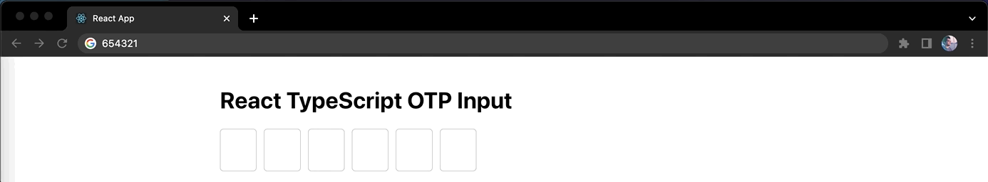
After saving the changes, we should see our web application in the browser like this:
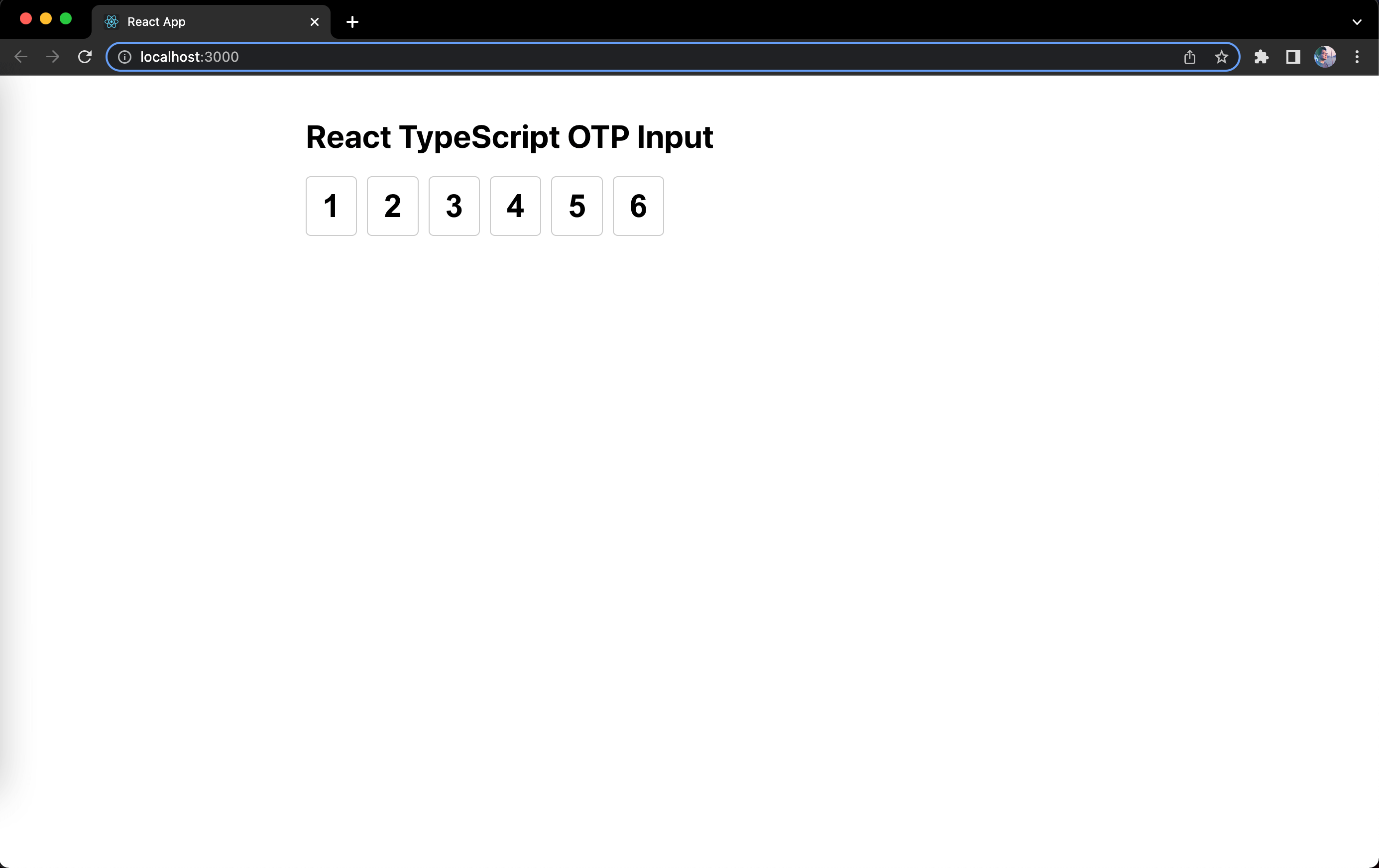
Great, that is looking like an OTP input now but it is lacking the logic that makes it an OTP input so let's proceed to implementing those.
Construct array from value prop
The first logic we need to implement is transforming the value string we get from the props into an array like we did earlier so that we can loop it and display them as individual input boxes. This time instead of hardcoding the array, it will be a dynamic array instead.
So for example we are given a value prop of '654321', we convert it into an array [6, 5, 4, 3, 2, 1]. This is achievable by just doing a JavaScript string method .split(''). But what if we are only given a string with less than the expected length (e.g. 6), let's say '214' which only has a length of 3 characters, our array should still be a length of 6 or the number we got from valueLength prop.
How do we do this?
We can utilize useMemo and use value and valueLength prop as dependencies, then do a loop using valueLength as the max index. Using the current index i in the loop, we check whether the character from the value string exists and it's a number. We can't simply use typeof and check if it's number because that will also be true for NaN, so we use a regular expression RegExp - that would be /^\d+$/. This regular expression contains metacharacters such as \d which finds a digit, then ^ means to begin with, and $ which means to end with. You can visit this page to know more about the JavaScript RegExp syntax, modifiers, brackets and other metacharacters. By combining them, this regular expression can test or check if a character is a digit (or a number). We can use this to check and push characters that are digits to the constructed array, and if it is not a digit then we simply push an empty string '' instead. This way we can construct an array that meets the length of the valueLength. If what I said here doesn't make any sense, the code hopefully might help.
First create a constant variable in src/constants.ts to keep our regular expression that checks or tests whether a string is a digit because we'll be using it more than once.
export const RE_DIGIT = new RegExp(/^\d+$/);
Then let's update our OtpInput component in src/components/OtpInput.tsx:
import { useMemo } from 'react';
import { RE_DIGIT } from '../constants';
...

export default function OtpInput({ value, valueLength, onChange }: Props) {
  const valueItems = useMemo(() => {
    const valueArray = value.split('');
    const items: Array<string> = [];

    for (let i = 0; i < valueLength; i++) {
      const char = valueArray[i];

      if (RE_DIGIT.test(char)) {
        items.push(char);
      } else {
        items.push('');
      }
    }

    return items;
  }, [value, valueLength]);

  return (
    <div className="otp-group">
      {valueItems.map((digit, idx) => (
        <input
          ...
        />
      ))}
    </div>
  );
}
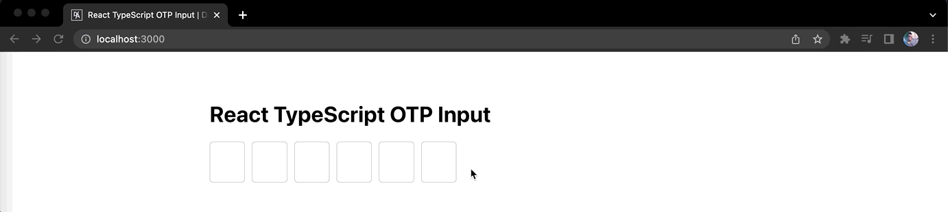
If you want to test if this logic really works, try replacing the default value in src/App.tsx:
...

export default function App() {
  const [otp, setOtp] = useState('654321');
  ...
}
You should see in the application in the browser like this:
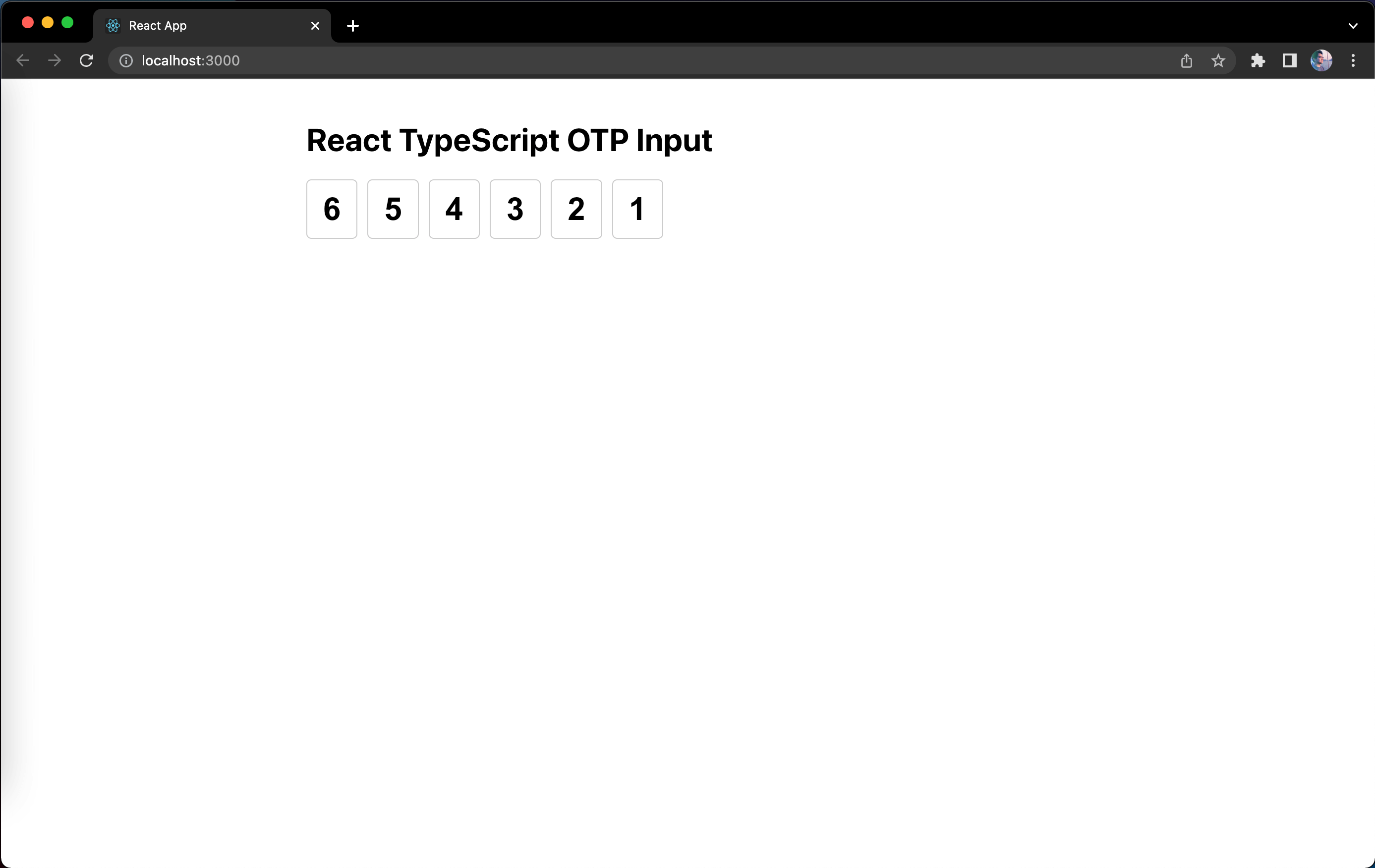
Great, that means our logic works. You can try changing the default value to something less than 6, e.g. 214 and it will just fill in the first three input boxes but still display the other input boxes unfilled.
Alright. After you're done testing it, revert the default value back to an empty string '' and let's proceed to the next logic.
Allow typing digits in input boxes
If you try to type anything on the inputs, it will not change, because the values are hardcoded to the array we constructed, and the said array only changes if the value prop changes from the parent App component. Currently, we're not doing anything to change the value prop from the parent component. So let's handle that.
We can attach an change event listener to each input box. The challenging part right here is that each input box is assigned to a position in the constructed array. So any change in a particular input box shouldn't affect the value from other inputs. We can make use of the index idx we got from looping the array to handle this along with the help of a JavaScript string method .substring() to construct the new value prop string. To change the value prop from the parent component, we can pass the new value to the onChange() prop function. We can also utilize here the regular expression we created earlier to only allow digits in the change event. If a user tries to input a letter or a special character, that shouldn't be displayed in the input boxes or simply does not update the value prop string. To write this in code, we'll have something like this in src/components/OtpInput.tsx:
import React, { useMemo } from 'react';
...

export default function OtpInput({ value, valueLength, onChange }: Props) {
  ...

  const inputOnChange = (
    e: React.ChangeEvent<HTMLInputElement>,
    idx: number
  ) => {
    const target = e.target;
    const targetValue = target.value;

    if (!RE_DIGIT.test(targetValue)) {
      return;
    }

    const newValue =
      value.substring(0, idx) + targetValue + value.substring(idx + 1);

    onChange(newValue);
  };

  return (
    <div className="otp-group">
      {valueItems.map((digit, idx) => (
        <input
          ...
          onChange={(e) => inputOnChange(e, idx)}
        />
      ))}
    </div>
  );
}
If you're new to TypeScript, we need to define the type for the arguments in the inputOnChange function here. The type for the onChange attribute in React is React.ChangeEvent from the imported react library which accepts the type of the element as an argument and that would be HTMLInputElement that is already available globally without importing it from anywhere.
Save the changes and let's see what happens when we try to input digits in the first input box. You'll notice the first digit we input is displayed correctly, but as you type more digits in the same input box, the other input boxes get populated but the focus is still in the same input box. This looks wrong and let's fix that by focusing on the next input box or the nextElementSibling. Update the file src/components/OtpInput.tsx with the following code:
...

export default function OtpInput({ value, valueLength, onChange }: Props) {
  ...

  const inputOnChange = (
    e: React.ChangeEvent<HTMLInputElement>,
    idx: number
  ) => {
    ...

    const nextElementSibling =
      target.nextElementSibling as HTMLInputElement | null;

    if (nextElementSibling) {
      nextElementSibling.focus();
    }
  };

  ...
}
If you're new to TypeScript, you'll notice I used as HTMLInputElement | null here. This is called a type assertion. If we remove the type assertion, the type of target.nextElementSibling would just be Element | null, and if we leave it like that, it will have a TypeScript error stating that .focus() is not a function in Element but it does exist if the type is HTMLInputElement. That's why a type assertion is done here when we have information about the type of a value that TypeScript possibly can't know about.
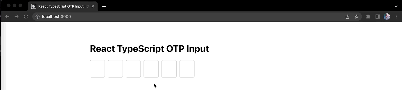
Alright, once you save the changes. Let's try typing digits into the input boxes again:
Wow, that looks smooth and it gives you a nice user experience!
What's next?
Allow deleting digits from input boxes
Currently, if you try to delete the digit from one of the input boxes using backspace in your keyboard, it does not do anything. Let's handle that.
If we relook at our logic in the inputOnChange function, we only allow digits. When we delete a digit, the change event will be triggered and the targetValue would be an empty string '' which is not a digit, but we can allow that to implement deletion. Once we allow an empty string '' from targetValue, we need to replace that with a space ' ' so that the values from other input boxes won't break since each input boxes is assigned to the position based from the value, for example value prop is 123456 which displays the input boxes like this [1][2][3][4][5][6]. If we were to delete a digit in the middle (e.g. 3) when there are digits (4, 5 and 6) on the right; the input boxes should be displayed like this [1][2][ ][4][5][6]. Let's translate this into the code and update src/components/OtpInput.tsx:
...

export default function OtpInput({ value, valueLength, onChange }: Props) {
  ...

  const inputOnChange = (
    e: React.ChangeEvent<HTMLInputElement>,
    idx: number
  ) => {
    const target = e.target;
    let targetValue = target.value;
    const isTargetValueDigit = RE_DIGIT.test(targetValue);

    if (!isTargetValueDigit && targetValue !== '') {
      return;
    }

    targetValue = isTargetValueDigit ? targetValue : ' ';

    const newValue =
      value.substring(0, idx) + targetValue + value.substring(idx + 1);

    onChange(newValue);

    if (!isTargetValueDigit) {
      return;
    }

    const nextElementSibling =
      target.nextElementSibling as HTMLInputElement | null;

    if (nextElementSibling) {
      nextElementSibling.focus();
    }
  };

  ...
}
Now save the changes and try typing digits and then delete them. It will delete the digit in the input box you're currently focused on. To improve the experience when you try to delete when there's already no digit in the input box, it should focus on the previous input box previousElementSibling and delete the digit in it. Do note that the change event will not be triggered if we try to press backspace where the input box is already empty. We will have to rely on the keydown event instead. Here's the code to handle that in src/components/OtpInput.tsx:
...

export default function OtpInput({ value, valueLength, onChange }: Props) {
  ...
  const inputOnKeyDown = (e: React.KeyboardEvent<HTMLInputElement>) => {
    const target = e.target as HTMLInputElement;

    if (e.key !== 'Backspace' || target.value !== '') {
      return;
    }

    const previousElementSibling =
      target.previousElementSibling as HTMLInputElement | null;

    if (previousElementSibling) {
      previousElementSibling.focus();
    }
  };

  return (
    <div className="otp-group">
      {valueItems.map((digit, idx) => (
        <input
          ...
          onKeyDown={inputOnKeyDown}
        />
      ))}
    </div>
  );
}
Once you save the changes, you can now delete each digit from the input boxes and it will also focus back to the previous input box if the current input box is already empty. Here's how it is in action:
Are we done? Nope. There's still a couple more things we need to do to make this OTP input better. Let's continue ~
Select digit on focus event
When we have typed the digits completely, and let's say we have input one incorrect digit in the middle, when we click on that input box, the input cursor caret may land on the right side of the digit and when that happens and you typed another digit, it messes up the digits from other input boxes. To fix that, simply do a selection of the digit using .setSelectionRange() in the input box on focus event. We should also do the same logic during the keydown event because when we focus on an input box and replace it with the same digit, it will not trigger the change event and the input cursor goes to the right and again that messes up the digits from other inputs once you type again.
To handle this, let's update src/components/OtpInput.tsx with the following code:
...

export default function OtpInput({ value, valueLength, onChange }: Props) {
  ...

  const inputOnKeyDown = (e: React.KeyboardEvent<HTMLInputElement>) => {
    const target = e.target as HTMLInputElement;
    const targetValue = target.value;

    // keep the selection range position
    // if the same digit was typed
    target.setSelectionRange(0, targetValue.length);

    ...
  };
  const inputOnFocus = (e: React.FocusEvent<HTMLInputElement>) => {
    const { target } = e;

    target.setSelectionRange(0, target.value.length);
  };

  return (
    <div className="otp-group">
      {valueItems.map((digit, idx) => (
        <input
          ...
          onFocus={inputOnFocus}
        />
      ))}
    </div>
  );
}
Once the changes are saved, try it out! Type in the digits until the last input box, then focus on the input box in the middle, change it into another digit, it will get updated and focus on the next input box. If you input the same digit, the focus will remain in the input box - keeping everything as is. Great!
Handle paste event
Now let's also handle the elephant in the room which is the paste event. Although, we will not be adding another event listener to our input boxes. We will simply update our inputOnChange logic because that is also triggered when doing a paste event.
Let's go further into the logic of the paste event. This might be depending on your requirement but I'll do what I think makes more sense. We should only allow paste when the copied text is a digit and also the same length as our valueLength. As an extra precaution, we are trimming the targetValue using .trim() in case users copied the code with an extra space from either or both ends of the string. Anything else such as having less or more length than the valueLength will be ignored or we simply won't do anything.
To translate that into code, simply update src/components/OtpInput.tsx:
...

export default function OtpInput({ value, valueLength, onChange }: Props) {
  ...

  const inputOnChange = (
    e: React.ChangeEvent<HTMLInputElement>,
    idx: number
  ) => {
    const target = e.target;
    let targetValue = target.value.trim();
    const isTargetValueDigit = RE_DIGIT.test(targetValue);

    if (!isTargetValueDigit && targetValue !== '') {
      return;
    }

    targetValue = isTargetValueDigit ? targetValue : ' ';

    const targetValueLength = targetValue.length;

    if (targetValueLength === 1) {
      const newValue =
        value.substring(0, idx) + targetValue + value.substring(idx + 1);

      onChange(newValue);

      if (!isTargetValueDigit) {
        return;
      }

      const nextElementSibling =
        target.nextElementSibling as HTMLInputElement | null;

      if (nextElementSibling) {
        nextElementSibling.focus();
      }
    } else if (targetValueLength === valueLength) {
      onChange(targetValue);

      target.blur();
    }
  };
  ...
}
We also did a target.blur() here to focus out of the input boxes since after you paste the code, most likely you won't be interacting with the input boxes anymore and your next step would be to submit the code.
Now try copying a 6 digit code (or depending on the value you passed in valueLength prop from the parent App component) and paste it in any of the input boxes, it doesn't matter if the input boxes have already been filled - it will still work and replace the previous digits. That's great!
Improve accessibility
To further improve the accessibility of our OTP input component, we also want to implement the feature to go through the input boxes when pressing the keyboard arrow keys. So if you are in the first input box, when you press either the right or down arrow keys, it should focus on the next input box and when you press either the left or up down arrow keys, it should focus on the previous input box. We already have the code to move the focus to the next or previous input box, so we can refactor the existing code to make them reusable and reduce duplication. We also already have the keydown event listener where we can add this new logic. Do note that these keys have default behavior in an input text, so we need to prevent that by calling Event.preventDefault().
To write this in code, simply update src/components/OtpInput.tsx with the following:
...

export default function OtpInput({ value, valueLength, onChange }: Props) {
  ...

  const focusToNextInput = (target: HTMLElement) => {
    const nextElementSibling =
      target.nextElementSibling as HTMLInputElement | null;

    if (nextElementSibling) {
      nextElementSibling.focus();
    }
  };
  const focusToPrevInput = (target: HTMLElement) => {
    const previousElementSibling =
      target.previousElementSibling as HTMLInputElement | null;

    if (previousElementSibling) {
      previousElementSibling.focus();
    }
  };
  const inputOnChange = (
    e: React.ChangeEvent<HTMLInputElement>,
    idx: number
  ) => {
    ...

    if (targetValue.length === 1) {
      ...

      if (!isTargetValueDigit) {
        return;
      }

      focusToNextInput(target);
    } else {
      ...
    }
  };
  const inputOnKeyDown = (e: React.KeyboardEvent<HTMLInputElement>) => {
    const { key } = e;
    const target = e.target as HTMLInputElement;

    if (key === 'ArrowRight' || key === 'ArrowDown') {
      e.preventDefault();
      return focusToNextInput(target);
    }

    if (key === 'ArrowLeft' || key === 'ArrowUp') {
      e.preventDefault();
      return focusToPrevInput(target);
    }

    const targetValue = target.value;

    ...

    if (e.key !== 'Backspace' || targetValue !== '') {
      return;
    }

    focusToPrevInput(target);
  };
  ...
}
Save those changes and test it out! Here's a demo of all the features we have implemented:
Fix focus and deletion issues (Oct. 17, 2022)
A few months later after I posted the video version of this blog on YouTube, I received a comment that there was an issue with the focus. Explaining it in words is kind of difficult so I created a GIF instead, here's the issue:
It doesn't look right when your focus is on the last input element but it starts typing out the digits on the first or other input elements. We need to fix this. I thought it would make sense to just focus from the first input element or from where the last digit was. I don't think most users will start writing the digits in random order. So for the fix, we can add a logic in the existing focus event listener of the input elements. Inside of it, we will first check if the previous input element has value. If there's value, then the focus remains on that input. If there's NO value, then we focus on the previous input element and that will fire or trigger the same focus event listener again which will recursively check the condition.
To implement this recursive condition check, let's update src/components/OtpInput.tsx with the following code:
...

export default function OtpInput({ value, valueLength, onChange }: Props) {
  ...
  const inputOnFocus = (e: React.FocusEvent<HTMLInputElement>) => {
    const { target } = e;

    // keep focusing back until previous input
    // element has value
    const prevInputEl =
      target.previousElementSibling as HTMLInputElement | null;

    if (prevInputEl && prevInputEl.value === '') {
      return prevInputEl.focus();
    }

    target.setSelectionRange(0, target.value.length);
  };
  ...
}
Once you saved the changes, it will fix the focus issue:

But... once this new logic has been implemented, it will introduce another issue. It is related to deleting digits in the middle. Here's the issue:
So in the GIF, you can see if we start deleting digits in the middle. It leaves some digits on the right. When you try to focus on the digit on the right, you won't be able to because of the new logic we just implemented. To fix this and make things simple, we simply won't allow deleting of digits in the middle by checking if the next input element has value.
Here's the logic we need to add in ``src/components/OtpInput.tsx`:
...

export default function OtpInput({ value, valueLength, onChange }: Props) {
  ...

  const inputOnChange = (
    e: React.ChangeEvent<HTMLInputElement>,
    idx: number
  ) => {
    ...

    if (!isTargetValueDigit && targetValue !== '') {
      return;
    }

    const nextInputEl = target.nextElementSibling as HTMLInputElement | null;

    // only delete digit if next input element has no value
    if (!isTargetValueDigit && nextInputEl && nextInputEl.value !== '') {
      return;
    }

    targetValue = isTargetValueDigit ? targetValue : ' ';

    ...
  };
  ...
}

In the GIF, you can see that we are not able to delete digits in the middle, but we can still replace it with another digit.
And that's it! We're done with the implementation part. Please proceed to the next part to learn how to write tests for the OTP input component we have just built.