Introduction
Accordions (or collapsible content) are useful for when you have a large amount of content to display and allow users to toggle between showing and hiding the content. This can be seen a lot in different websites today. Learn how to build your own accordion in React and TypeScript. I'll also cover how to write tests for it and achieve 100% coverage using Jest and Testing Library, these two libraries are used together to test React components. If you're new to TypeScript and Jest/Testing Library, this is a good way to start learning it with simple components like this. Alright, here we go ~
Prerequisites
This is the link to the accordion which we'll accomplish by the end of this post, you can see and play around with it or use it as your reference throughout this tutorial.
By the way, upon writing this post, I assume that you have some web development background and basic knowledge regarding npm, yarn, HTML, CSS, JavaScript and React.
Make sure to install Yarn in your system if you haven't. We use Yarn as our package manager, it's just like npm but faster.
I've written a separate post about the IDE and extensions I use to help me save time and energy when writing my code in React. I highly suggest that you check it out if you haven't!
Initialize your project
Fastest way to get started with React is using the Create React App. It is an officially supported way to create single-page React applications. It offers a modern build setup with no configuration so you can focus on code, not build tools.
To create our project with React and TypeScript, run this command in your terminal:
yarn create react-app react-typescript-accordion --template typescript
Once installed, let's run our project to see if everything is working fine by executing the command below:
cd react-typescript-accordion
yarn start
This command will open your default browser and go to http://localhost:3000/. If it doesn't, you can do it yourself too.
This setup comes with live-editing or hot reloading which means when we save file changes, it will automatically update the app and reload on the browser. That's great for local development!
Clean up the project
Now, let's clean up our project which was created by Create React App. We won't be needing some of them. Delete or clear the contents of the following below:
- src/App.css (clear contents)
- src/App.test.tsx (delete)
- src/logo.svg (delete)
Then let's update the code of src/App.tsx:
import './App.css';

function App() {
  return <div className="container"></div>;
}

export default App;
We will use the App component as the container of our accordion. So just a small update on the src/App.css:
.container {
  width: 600px;
  max-width: 100%;
  margin: 0 auto;
  padding: 20px 15px;
}
And update the src/index.css too:
* {
  box-sizing: border-box;
}

body {
  margin: 0;
  font-family: -apple-system, BlinkMacSystemFont, 'Segoe UI', 'Roboto', 'Oxygen',
    'Ubuntu', 'Cantarell', 'Fira Sans', 'Droid Sans', 'Helvetica Neue',
    sans-serif;
  -webkit-font-smoothing: antialiased;
  -moz-osx-font-smoothing: grayscale;
  line-height: 1.6;
}
Sample data + Accordion component
Now, let's create sample data that we can pass to our accordion component because we would want our accordion to be reusable, so it should accept data as props. We can initialize the data from a parent component so for our case, it would be src/App.tsx. I have a sample data that we can use here, update the code of it:
import './App.css';
import Accordion from './components/Accordion';

function App() {
  const accordionItems = [
    {
      title: 'Accordion Item #1',
      content: (
        <div>
          <strong>This is the first item's accordion body.</strong> It is hidden
          by default, but shown when the title is clicked. It will also be
          hidden if the title is clicked again or when another item is clicked.
          You can pass HTML tags in the content such as <u>underline tag</u>,{' '}
          <i>italic</i>, or even another list like this:
          <ul>
            <li>Bread</li>
            <li>Eggs</li>
            <li>Milk</li>
          </ul>
        </div>
      ),
    },
    {
      title: 'Accordion Item #2',
      content: (
        <div>
          <strong>This is the second item's accordion body.</strong> It is
          hidden by default, but shown when the title is clicked. It will also
          be hidden if the title is clicked again or when another item is
          clicked. You can pass HTML tags in the content such as{' '}
          <u>underline tag</u>, <i>italic</i>, or even another list like this:
          <ul>
            <li>Bread</li>
            <li>Eggs</li>
            <li>Milk</li>
          </ul>
        </div>
      ),
    },
    {
      title: 'Accordion Item #3',
      content: (
        <div>
          <strong>This is the third item's accordion body.</strong> It is hidden
          by default, but shown when the title is clicked. It will also be
          hidden if the title is clicked again or when another item is clicked.
          You can pass HTML tags in the content such as <u>underline tag</u>,{' '}
          <i>italic</i>, or even another list like this:
          <ul>
            <li>Bread</li>
            <li>Eggs</li>
            <li>Milk</li>
          </ul>
        </div>
      ),
    },
  ];

  return (
    <div className="container">
      <Accordion items={accordionItems} />
    </div>
  );
}

export default App;
If you save the changes we would get errors in the meantime as we would still need to create the Accordion component. So create a folder under src and name it components. We can put our reusable components in this folder. After that, create a file named Accordion.tsx inside the components folder.
Then, let's add the code for src/components/Accordion.tsx:
import { AccordionData } from '../types';

function Accordion({ items }: { items: Array<AccordionData> }) {
  return <ul className="accordion"></ul>;
}

export default Accordion;
If you're new to TypeScript, the object besides the props will look foreign to you. It would be explained better once we do the remaining change. For now, create a new file types.ts inside the src folder and add the following code to it:
import { ReactNode } from 'react';

export type AccordionData = {
  title: string;
  content: ReactNode;
};
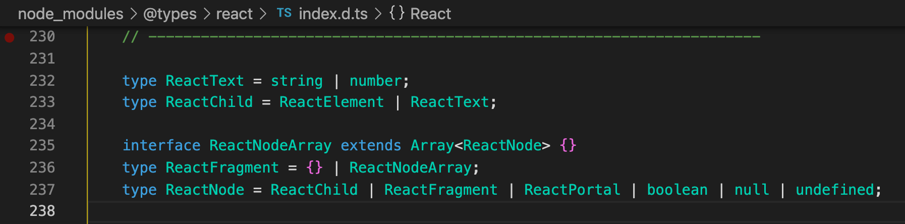
Now comes the explanation part for those of you who are new to TypeScript, feel free to skip this if you are already familiar with it. So we are defining the type for the items props that our Accordion component will accept. So we declared a type AccordionData which is an object that contains title that should only be a string, one of the primitive types in TypeScript, and content that should only be a ReactNode, a type defined by React library, same thing we did when we defined our type AccordionData. We can hover to a non-primitive type and it will show a tooltip with more information about the type like this:
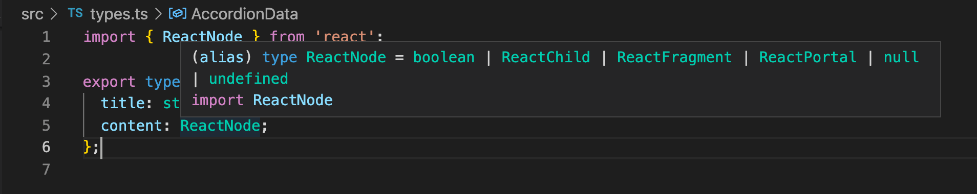
You can also Cmd + click (Ctrl + click on Windows) to view the type with even more information.
So we created src/types.ts so that it can be exported and imported across different components which you will see in a bit. Since the Accordion component accepts an array of AccordionData, we wrapped it in type Array like this - Array<AccordionData>. You can also wrap it like this - AccordionData[], I just prefer the former as I can read it as an "array of accordion data".
Now if we didn't pass the expected data or type for items props to our accordion component, our IDE would display an inline error and hovering it would show something like this:
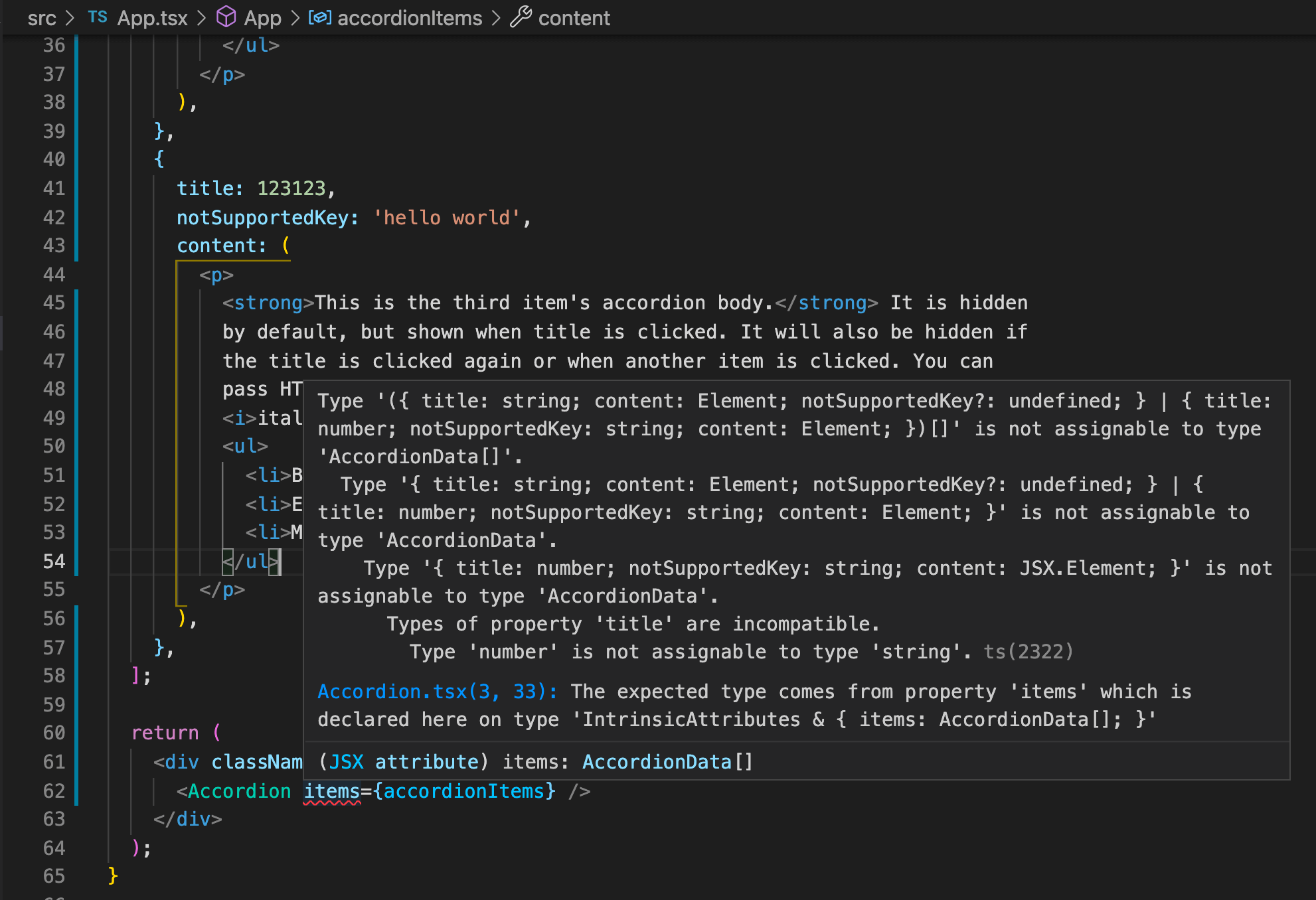
This is why TypeScript is really helpful for catching errors early while you're still writing the code.
Accordion Item component
Alright, let's create a new component under components and name it AccordionItem.tsx. This will be the component used by each item in our accordion. Add the following code below to display both the title and content of each item:
import { AccordionData } from '../types';

function AccordionItem({ data }: { data: AccordionData }) {
  return (
    <li className="accordion-item">
      <h2 className="accordion-item-title">
        <button className="accordion-item-btn">{data.title}</button>
      </h2>
      <div className="accordion-item-container">
        <div className="accordion-item-content">{data.content}</div>
      </div>
    </li>
  );
}

export default AccordionItem;
As you can see here, we've also added a type for data which should only be AccordionData, this is where we reused the type we declared and exported earlier in src/types.ts.
Now let's go back to src/components/Accordion.tsx and update the code to loop through the items and pass the data to the imported AccordionItem component:
...
import AccordionItem from './AccordionItem';
...
    <ul className="accordion">
      {items.map((item, idx) => (
        <AccordionItem key={idx} data={item} />
      ))}
    </ul>
...
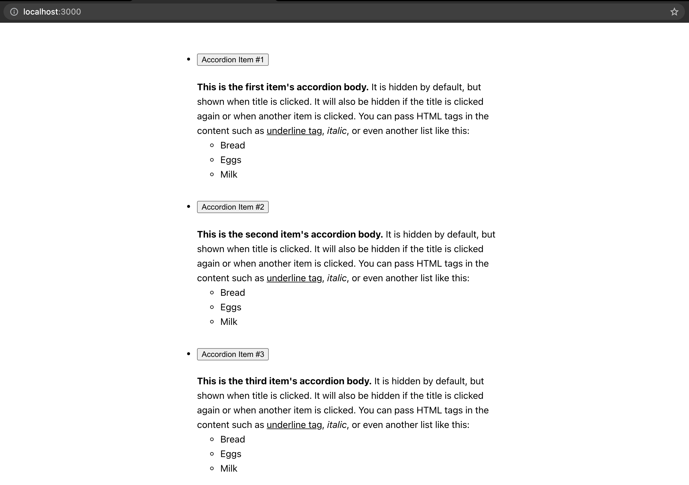
Once you save the changes, our web app should be working fine now without any errors and display something like this:
Accordion styles
Yes, it doesn't look like an accordion yet. So let's create the styles and import them to their respective components. Create Accordion.css under components folder and add the following code below:
.accordion {
  list-style: none;
  margin: 0;
  padding: 0;
}
Then import it in Accordion.tsx:
import { AccordionData } from '../types';
import AccordionItem from './AccordionItem';
import './Accordion.css';

function Accordion({ items }: { items: Array<AccordionData> }) {
...
Next, create AccordionItem.css under components folder and add the following code below:
.accordion-item {
  border: 1px solid #ccc;
}

.accordion-item:not(:first-of-type) {
  border-top: 0;
}

.accordion-item-title {
  width: 100%;
  margin: 0;
}

.accordion-item-btn {
  display: flex;
  align-items: center;
  width: 100%;
  background-color: #fff;
  border: 0;
  padding: 15px 20px;
  font-size: 18px;
  font-weight: 400;
  cursor: pointer;
  user-select: none;
}

.accordion-item-btn::after {
  content: '';
  flex-shrink: 0;
  width: 18px;
  height: 18px;
  margin-left: auto;
  background-image: url("data:image/svg+xml,%3csvg xmlns='http://www.w3.org/2000/svg' viewBox='0 0 16 16' fill='%23212529'%3e%3cpath fill-rule='evenodd' d='M1.646 4.646a.5.5 0 0 1 .708 0L8 10.293l5.646-5.647a.5.5 0 0 1 .708.708l-6 6a.5.5 0 0 1-.708 0l-6-6a.5.5 0 0 1 0-.708z'/%3e%3c/svg%3e");
  background-repeat: no-repeat;
  background-size: 18px;
  transition: transform 0.2s ease-in-out;
}

.accordion-item.active .accordion-item-btn::after {
  transform: rotate(-180deg);
}

.accordion-item-container {
  transition: height 0.2s ease-in-out;
  overflow: hidden;
}

.accordion-item-content {
  border-top: 1px solid #cccccc;
  padding: 15px 20px;
}
And import it in AccordionItem.tsx:
import { AccordionData } from '../types';
import './AccordionItem.css';

function AccordionItem({ data }: { data: AccordionData }) {
...
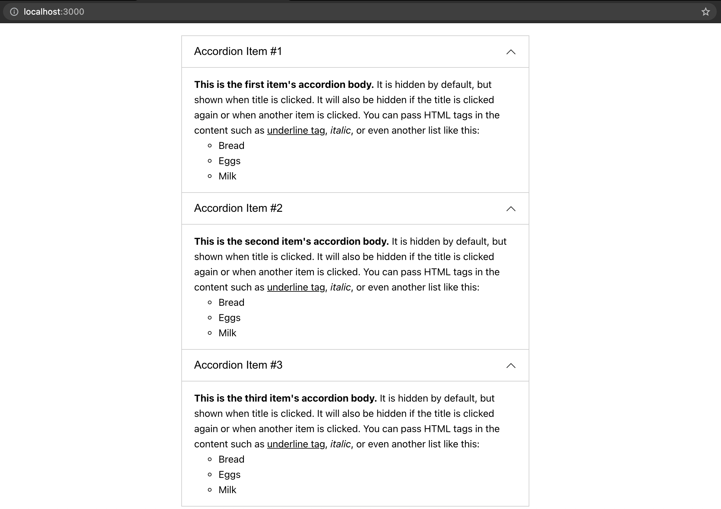
Once you saved the changes, our component should look like this now:
Accordion Item props
That's looking like an accordion now. We just need to make it collapsible. Let's start with the logic for AccordionItem.tsx. It should accept a prop isOpen to determine whether to display the content or not. We can simply use a conditional statement like this:
import { AccordionData } from '../types';
import './AccordionItem.css';

function AccordionItem({
  data,
  isOpen,
}: {
  data: AccordionData;
  isOpen: boolean;
}) {
  return (
    <li className="accordion-item">
      <h2 className="accordion-item-title">
        <button className="accordion-item-btn">{data.title}</button>
      </h2>
      <div className="accordion-item-container">
        {isOpen && <div className="accordion-item-content">{data.content}</div>}
      </div>
    </li>
  );
}

export default AccordionItem;
And we would be done with this component but because we want it to have a transition, then we need to be more creative here. What can we use then? Yes, you've guessed it! We can control the height of the content's container. If isOpen is false, then we set the height of the container to 0, and if it's true, then we set the height using the content's height. Since isOpen can change at any point of time, we can use one of the React hooks, useEffect, to help us with this accordion logic. Let's update the code of AccordionItem.tsx:
import { useEffect, useRef, useState } from 'react';
import { AccordionData } from '../types';
import './AccordionItem.css';

function AccordionItem({
  data,
  isOpen,
  btnOnClick,
}: {
  data: AccordionData;
  isOpen: boolean;
  btnOnClick: () => void;
}) {
  const contentRef = useRef<HTMLDivElement>(null);
  const [height, setHeight] = useState(0);

  useEffect(() => {
    if (isOpen) {
      const contentEl = contentRef.current as HTMLDivElement;

      setHeight(contentEl.scrollHeight);
    } else {
      setHeight(0);
    }
  }, [isOpen]);

  return (
    <li className={`accordion-item ${isOpen ? 'active' : ''}`}>
      <h2 className="accordion-item-title">
        <button className="accordion-item-btn" onClick={btnOnClick}>
          {data.title}
        </button>
      </h2>
      <div className="accordion-item-container" style={{ height }}>
        <div ref={contentRef} className="accordion-item-content">
          {data.content}
        </div>
      </div>
    </li>
  );
}

export default AccordionItem;
And if you're new to TypeScript, you'll notice I used as HTMLDivElement here. This is called a type assertion. If we remove the type assertion, the type of contentEl.current would be HTMLDivElement | null, but we know in this case it will always have a value of HTMLDivElement when useEffect is executed. That's why type assertions are done when you have information about the type of a value that TypeScript can't know about.
When isOpen is true, we should also add an active class so that the icon would rotate, it's a common transition effect whenever you toggle an accordion.
I've also added a new prop btnOnClick which accepts a callback when the button is clicked. We'll use this later to control when to display or hide our content from the parent component.
Accordion logic (open one at a time)
Moving on to the Accordion.tsx, this is where we'll be adding the logic for each accordion item. When an accordion button is clicked, then we should show the contents. We could store a state of which item is displayed, it should be something unique to that item, since our items don't have an identifier (or ID) in their data, we could use the index of each item. I could think of two ways an accordion behaves, the one that we'll do in this post (which is my favorite by the way!) is opening an accordion one at a time, meaning when there's an accordion that's currently opened, when I click another one, it will close or hide the previous one and display the content of what I last clicked upon. To do that logic, update the Accordion component with the following code below:
import { useState } from 'react';
import { AccordionData } from '../types';
import AccordionItem from './AccordionItem';
import './Accordion.css';

function Accordion({ items }: { items: Array<AccordionData> }) {
  const [currentIdx, setCurrentIdx] = useState(-1);
  const btnOnClick = (idx: number) => {
    setCurrentIdx(idx);
  };

  return (
    <ul className="accordion">
      {items.map((item, idx) => (
        <AccordionItem
          key={idx}
          data={item}
          isOpen={idx === currentIdx}
          btnOnClick={() => btnOnClick(idx)}
        />
      ))}
    </ul>
  );
}

export default Accordion;
The initial state value of currentIdx (current index) would be -1, which means no accordion would be open at the start. When an accordion button is clicked, we would set the currentIdx to that accordion's index. This makes the isOpen become true since idx and currentIdx values are equal.
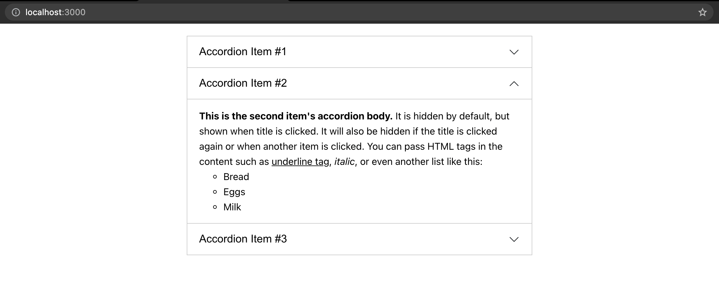
Once you save the changes, you now have yourself an accordion!
But wait there's one last thing you need to do. If we click on the same accordion again, it still remains open, ideally it should close. So let's do a small update to the code:
...
  const btnOnClick = (idx: number) => {
    setCurrentIdx((currentValue) => (currentValue !== idx ? idx : -1));
  };
...
And there you go, you've just built your own accordion in React and TypeScript!
Write tests for Accordion.tsx
Alright, time to write tests for the components we've built. Tests are really great as it helps us cover all the logics in our code and whenever we update the codebase, they help us determine whether we broke anything before the changes get pushed to our repository.
Before we start, let's install a library called faker which gives us random data. Why do we want random data? It makes our tests more reliable as opposed to hardcoding the data we use in testing. Run the command below on your terminal to install it along with its type:
yarn add faker@5.5.3 @types/faker@5.5.9
Since our project uses TypeScript, when installing libraries, we would have to install their types as well, because if not TypeScript would display an error that it couldn't find the library's type declarations.
That's all we need to install because the Create React App already set up and installed the necessary libraries for our testing environment such as Jest and Testing Library.
For test files, I like to separate them in a folder so that it's less cluttered when viewing main files. Now, create a new folder named __tests__ under the src/components. This is where we will put the test files for components under src/components.
Alright, the first component we would be writing tests for is Accordion.tsx. Create a file under src/components/__tests__ and name it Accordion.test.tsx.
Then let's add in the structure of the test:
import Accordion from '../Accordion';

describe('<Accordion />', () => {});
describe creates a block that groups together several related tests. So ideally the description should be describing what we are testing, in this case I used the component name. Feel free to rename it according to your preference. describe is one of Jest's global functions, so with the setup of Create React App, we don't need to specifically import these global functions in our code, we can just directly use them.
Next we can add a test case inside the describe block:
describe('<Accordion />', () => {
  it('should render items', () => {});
});
Another global function by Jest, it (or test) method runs a test. This is where we can have different test cases. Let's write our first test case:
import { render, screen } from '@testing-library/react';
import faker from 'faker';
import Accordion from '../Accordion';

describe('<Accordion />', () => {
  it('should render items', () => {
    const items = [];

    for (let i = 0; i < 3; i++) {
      items.push({
        title: faker.lorem.sentence(),
        content: faker.lorem.sentences(),
      });
    }

    render(<Accordion items={items} />);

    items.forEach(({ title, content }) => {
      const titleEl = screen.queryByText(title);
      const contentEl = screen.queryByText(content);

      expect(titleEl).toBeInTheDocument();
      expect(contentEl).toBeInTheDocument();
    });
  });
});
That's a lot of new code! Don't worry, let me go through it one by one and explain it to you. So first, we created an items array which would contain an object of AccordionData. We are using faker library to help us generate random titles and content. You can check out their API here to know all the other data it can randomly generate. We've added three items which should be enough but you can increase or decrease it if you want, but do note that it should have at least two items in order to test our accordion logic. We then pass this array as a props to our Accordion component. Using one of the Testing Library's methods, render, helps to render our component in a test environment, do note this environment is not a browser, so there are some limitations and mockings we would have to do which you'll see later on. To learn more about the render method, you can go here. After that, we can do our checks to validate that our items are rendered. To do that, we looped through the items and did a query by text using another method of Testing Library which is screen.queryByText. To know all the possible queries you can do with the screen object, you can go here. Then finally using one of Jest's global functions, we can call expect method and pass the elements returned by the query, and run what we call a matcher method toBeInTheDocument(). This is one of many custom matcher methods provided by the library called jest-dom which are specific to the DOM. While you can check this documentation for the more generic matcher methods.
Alright, I hoped that explained it.
Now let's check if our component passed the test by running the command below in your terminal:
yarn test --coverage
The parameter --coverage helps to display the coverage of the tests in which you'll see in your terminal:
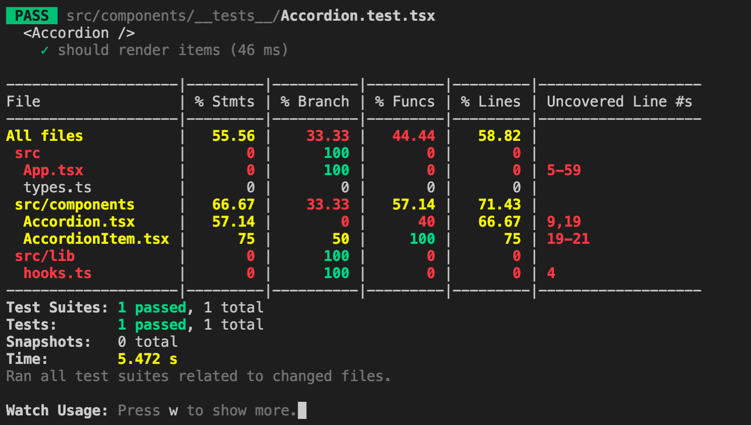
Our first test case passed! We also managed to cover 66.67% of lines of Accordion.tsx. With the --coverage parameter, it gives us hints of which lines are uncovered as well, that is line 9 and 19. If we check those lines in our Accordion.tsx file, these are related to the logic of opening an accordion item. So let's create the second test case:
import { fireEvent, render, screen } from '@testing-library/react';
...
  it('should open one at a time', () => {
    const items = [];

    for (let i = 0; i < 3; i++) {
      items.push({
        title: faker.lorem.sentence(),
        content: faker.lorem.sentences(),
      });
    }

    render(<Accordion items={items} />);

    items.forEach(({ title }) => {
      const titleEl = screen.queryByText(title) as HTMLButtonElement;

      fireEvent.click(titleEl);

      const currentListEl = titleEl.closest('li');
      const activeListEls = document.querySelectorAll('li.active');
      const activeListEl = activeListEls[0];

      expect(activeListEls.length).toBe(1);
      expect(activeListEl).toEqual(currentListEl);
    });
  });
});
Here we did the same for generating random data for the props but inside the loop we're doing the checks differently. So first we query the element of the title and fire a click event on it using fireEvent which is imported from the Testing Library. To fire other DOM events, you can check out the documentation here. Any query of an element may result as null so we added a type assertion (as HTMLButtonElement) because fireEvent method doesn't accept null values, it is safe to use type assertion here because we are certain that the element is or should be in the DOM. Then we queried the list element with an active class and checked whether it is the same element as the current item's list element, this verifies that our current item is opened. We also did an additional check to make sure that there's only one accordion that is opened at a time (or per loop) by checking that the length of all list items that has an active class should only be 1.
Currently if you didn't stop the test script server, it will listen for file save changes and automatically run the tests again. This makes writing tests faster as we don't have to re-run the test script again on every change. Our test coverage should look like this now:
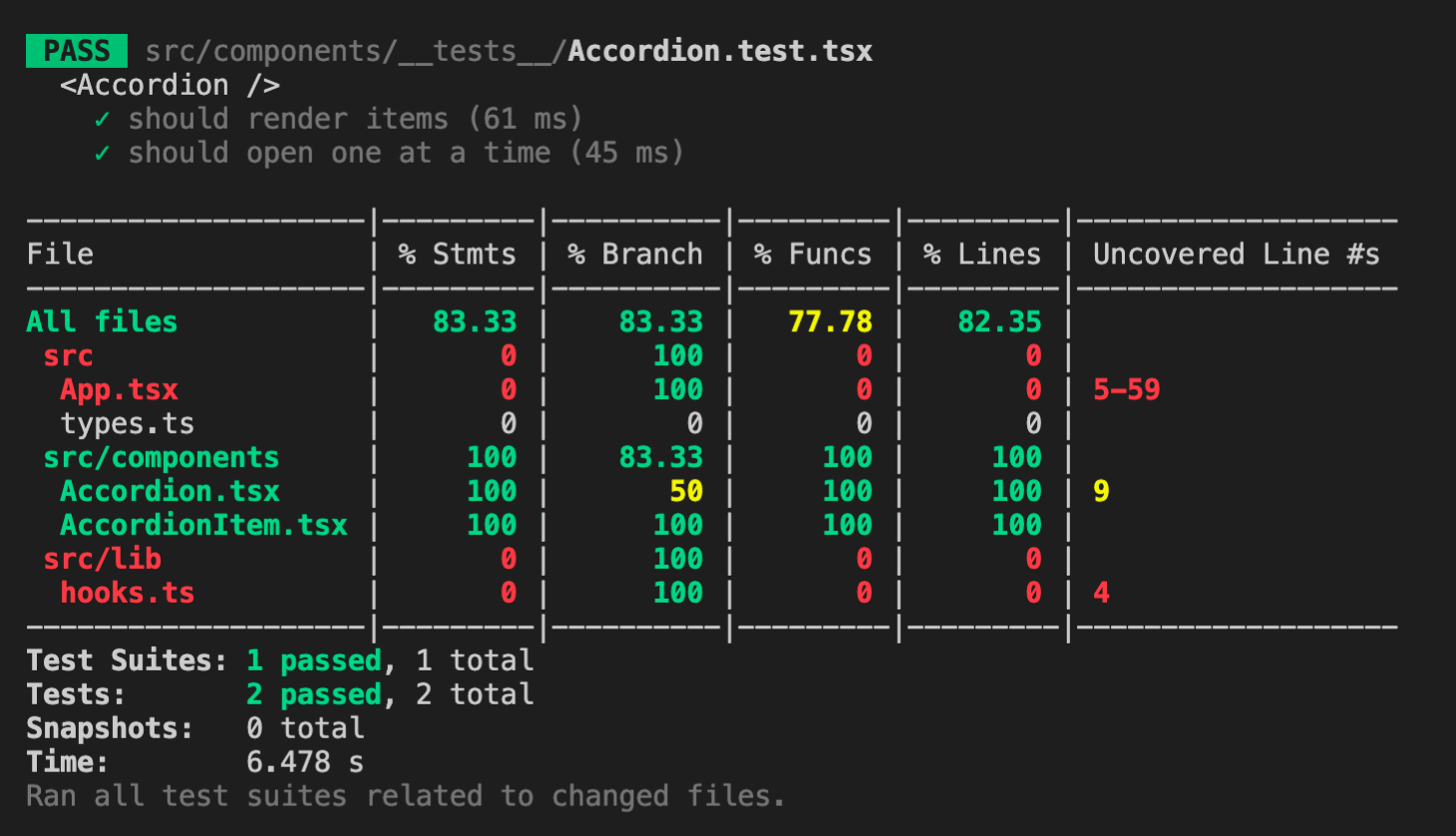
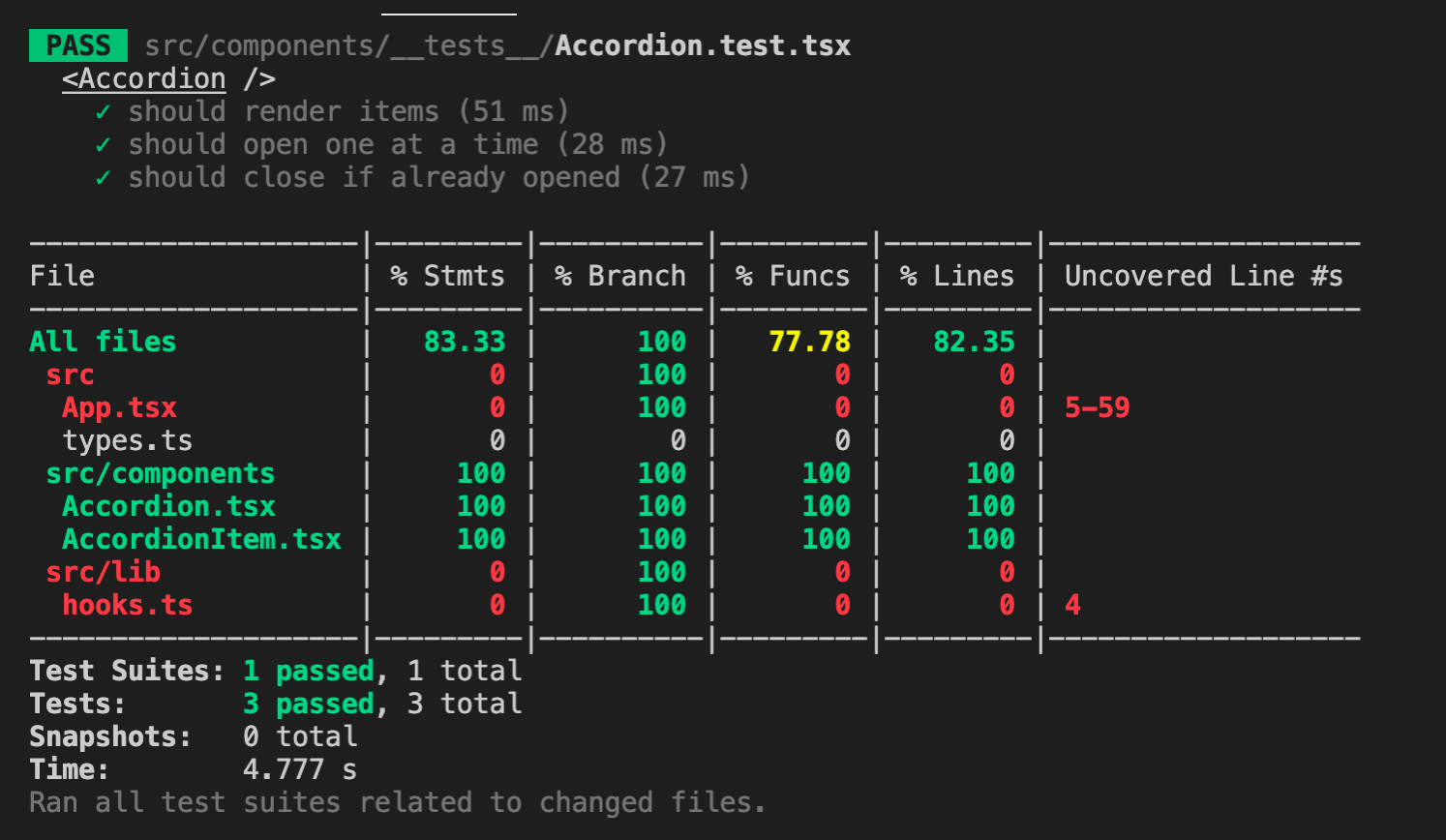
Awesome, our second test case passed as well! But line 9 is still uncovered though. If we check that line in our file, it is the logic for closing an opened accordion if the title is clicked again. So for the last test case, we can achieve the full coverage for Accordion.tsx by writing the code below:
...
  it('should close if already opened', () => {
    const items = [];

    for (let i = 0; i < 3; i++) {
      items.push({
        title: faker.lorem.sentence(),
        content: faker.lorem.sentences(),
      });
    }

    render(<Accordion items={items} />);

    items.forEach(({ title }) => {
      const titleEl = screen.queryByText(title) as HTMLButtonElement;

      fireEvent.click(titleEl);
      fireEvent.click(titleEl);

      const currentListEl = titleEl.closest('li');

      expect(currentListEl).not.toHaveClass('active');
    });
  });
});
Here we fire two click events and check that the current item's list element does not contain an active class which is a determinator that the accordion is opened.
Now once we save the changes, our coverage should look like this:
Cool! If you look at AccordionItem.tsx it already has 100% coverage as well. That's because it is also used in Accordion.tsx test cases. But it's always good to have each component or function to have its own test cases as well, because that will make our code more robust.
Write tests for AccordionItem.tsx
Create a file under src/components/__tests__ and name it AccordionItem.test.tsx. If we want to see how much is covered in AccordionItem.tsx while we write tests for it and ignore Accordion.test.tsx test cases from running, we can do so by running the test script like this:
yarn test --coverage src/components/__tests__/AccordionItem.test.tsx
This instructs Jest to only run the tests under src/components/__tests__/AccordionItem.test.tsx. For now it would fail because it must contain at least one test. So let's write the first test case:
import { render, screen } from '@testing-library/react';
import faker from 'faker';
import AccordionItem from '../AccordionItem';

describe('<AccordionItem />', () => {
  it('should render content', () => {
    const title = faker.lorem.sentence();
    const content = faker.lorem.sentences();

    render(
      <AccordionItem
        data={{ title, content }}
        isOpen={faker.datatype.boolean()}
        btnOnClick={jest.fn()}
      />
    );

    const titleEl = screen.queryByText(title);
    const contentEl = screen.queryByText(content);

    expect(titleEl).toBeInTheDocument();
    expect(contentEl).toBeInTheDocument();
  });
});
These should look familiar to you as we did the same for our first test case in Accordion.test.tsx but here we didn't have to create an array of data and loop through the items to do the checks.
After saving the changes, the terminal should display this:
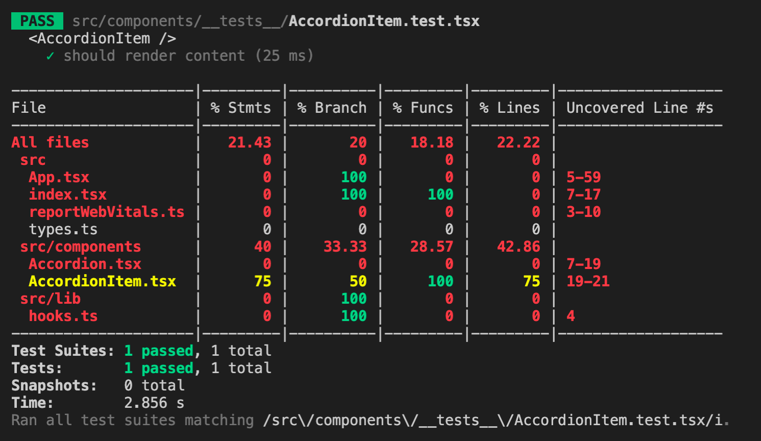
Here, the uncovered lines for AccordionItem.tsx is 19-21, but it could be line 23 on your side because we are passing a random boolean for isOpen props in our first test case. So let's create two new test cases, one for when isOpen is false and one for when isOpen is true and we can validate whether the accordion is open or not by checking if there is an active class in the list element or not. Write the following code below:
...
  it('should not display content if isOpen is false', () => {
    const title = faker.lorem.sentence();
    const content = faker.lorem.sentences();

    render(
      <AccordionItem
        data={{
          title,
          content,
        }}
        isOpen={false}
        btnOnClick={jest.fn()}
      />
    );

    const titleEl = screen.queryByText(title);
    const listEl = titleEl?.closest('li');

    expect(listEl).not.toHaveClass('active');
  });

  it('should display content if isOpen is true', () => {
    const title = faker.lorem.sentence();
    const content = faker.lorem.sentences();

    render(
      <AccordionItem
        data={{
          title,
          content,
        }}
        isOpen={true}
        btnOnClick={jest.fn()}
      />
    );

    const titleEl = screen.queryByText(title);
    const listEl = titleEl?.closest('li');

    expect(listEl).toHaveClass('active');
  });
});
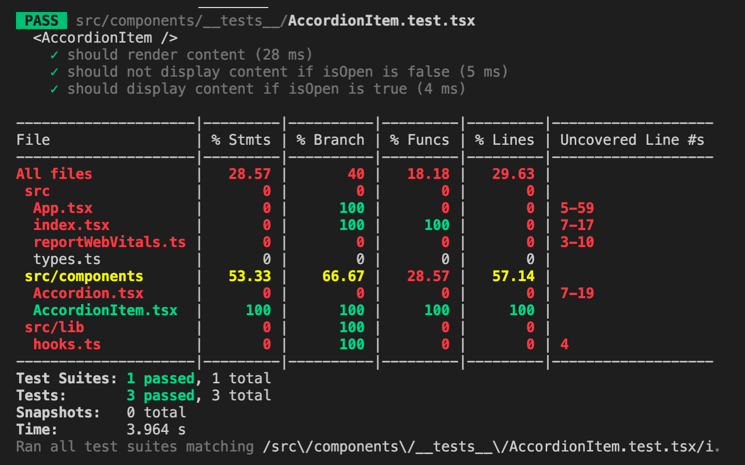
Once changes are saved, we would achieve 100% test coverage for AccordionItem.test.tsx:
You may be wondering, active class just adds the style to rotate the arrow icon but is not really responsible for displaying or hiding the content. That is actually based on the height of the container. Can we test that too? Yes, but we will need to update our existing code in AccordionItem.tsx because in a test environment, values like scrollHeight is always 0 because it does not update measurements like a browser, this is the limitation that I've mentioned earlier. If that's the case, our test case for checking that the height is more than 0 when isOpen is true would fail. So what should we do?
First, create a folder named lib under the src folder. Then create a file under src/lib and name it hooks.ts. Add the following code inside the newly created file:
import { RefObject } from 'react';

export function getRefValue<C>(ref: RefObject<C>) {
  return ref.current as C;
}
This is a utility for getting the value of a RefObject. I use this a lot in my projects and it is extremely helpful when writing tests to achieve 100% coverage, especially those components that use RefObject for elements. If you're new to TypeScript, you might be wondering what is this C around the code? It can be any letter by the way or word if you would like, and it is called Generics, it makes our utility function here accept the type defined when the RefObject is passed because it can have any type. Using Generics, our function here would be able to return the same type.
Then let's update our AccordionItem.tsx:
...
import { getRefValue } from '../lib/hooks';
...
      const contentEl = getRefValue(contentRef);
Now back to our test file src/components/__tests__/AccordionItem.test.tsx, let's update our two test cases and add the additional checks:
...
import * as hooks from '../../lib/hooks';
...
describe('<AccordionItem />', () => {
  beforeEach(() => {
    jest.restoreAllMocks();
  });
  ...
  it('should not display content if isOpen is false', () => {
    const contentScrollHeight = faker.datatype.number({ min: 1 });

    jest.spyOn(hooks, 'getRefValue').mockReturnValue({
      scrollHeight: contentScrollHeight,
    });

    const title = faker.lorem.sentence();
    const content = faker.lorem.sentences();

    render(
      <AccordionItem
        data={{
          title,
          content,
        }}
        isOpen={false}
        btnOnClick={jest.fn()}
      />
    );

    const titleEl = screen.queryByText(title);
    const listEl = titleEl?.closest('li');
    const contentEl = screen.queryByText(content);
    const contentContainerEl = contentEl?.parentElement;

    expect(listEl).not.toHaveClass('active');
    expect(contentContainerEl).toHaveStyle({ height: '0px' });
  });

  it('should display content if isOpen is true', () => {
    const contentScrollHeight = faker.datatype.number({ min: 1 });

    jest.spyOn(hooks, 'getRefValue').mockReturnValue({
      scrollHeight: contentScrollHeight,
    });

    const title = faker.lorem.sentence();
    const content = faker.lorem.sentences();

    render(
      <AccordionItem
        data={{
          title,
          content,
        }}
        isOpen={true}
        btnOnClick={jest.fn()}
      />
    );

    const titleEl = screen.queryByText(title);
    const listEl = titleEl?.closest('li');
    const contentEl = screen.queryByText(content);
    const contentContainerEl = contentEl?.parentElement;

    expect(listEl).toHaveClass('active');
    expect(contentContainerEl).toHaveStyle({
      height: `${contentScrollHeight}px`,
    });
  });
});
Let's analyze the updated code. First, we imported our hooks file using * as hooks in order to get an object of methods from src/lib/hooks.ts. We then use one of Jest's methods called jest.spyOn which tracks the calls to object[methodName] that you passed to it. It returns a Jest mock function which we can mock to return a different value using .mockReturnValue(). To see all the mock functions you could do, check them out here. When we do mocks in our test cases, it does not get restored back to their original value in the next test case, this might cause potential issues with the next test cases so it's good to call jest.restoreAllMocks() to prevent that. Instead of calling this function in the beginning of every test case, we can put the call inside one of Jest's methods beforeEach, it accepts a callback which will be called before each test case, and put it inside the describe call back right at the beginning before any test cases.
So we mocked the scroll height of the content element with a random generated number (minimum should be 1 because 0 means the content is hidden) and did the checks based on our accordion item logic. If the accordion item is opened, the content element's container should have the same height as the scroll height of the content element. If it's closed, then the height should be 0px.
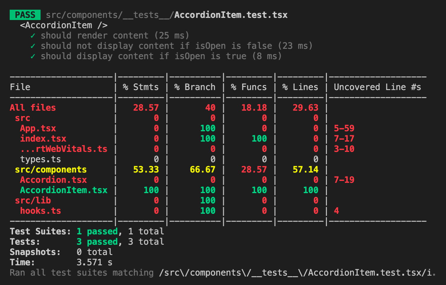
Now if we check our test results, it should be like this:
Great! Even though it already has 100% test coverage, let's not forget to test the btnOnClick props, same reason for having each component or function having their own tests, each props you introduce, if logical, should also have their own tests. Similar to what we did in Accordion.test.tsx, we can fire a click event to the title of the accordion item, but in this case our verification would be to check if the function passed in the props was called. To validate that, add the following code below:
import { fireEvent, render, screen } from '@testing-library/react';
...
  it('should call btnOnClick on title click', () => {
    const btnOnClickMock = jest.fn();

    const title = faker.lorem.sentence();
    const content = faker.lorem.sentences();

    render(
      <AccordionItem
        data={{
          title,
          content,
        }}
        isOpen={faker.datatype.boolean()}
        btnOnClick={btnOnClickMock}
      />
    );

    const titleEl = screen.queryByText(title) as HTMLButtonElement;

    fireEvent.click(titleEl);

    expect(btnOnClickMock).toBeCalledTimes(1);
  });
});
Write tests for hooks.ts
I've mentioned earlier that each component or function we create should have their own tests. So as a bonus, here's the test case for the hooks utility we created earlier, the code below should be added inside src/lib/__tests__/hooks.test.ts:
import faker from 'faker';
import { getRefValue } from '../hooks';

describe('hooks utilities', () => {
  describe('getRefValue()', () => {
    it('should return the value', () => {
      const refValue = faker.lorem.sentence();
      const refObject = { current: refValue };
      const res = getRefValue(refObject);

      expect(res).toBe(refValue);
    });
  });
  a;
});
Write tests for App.tsx
And then here's the code for testing our App component under src/__tests__/App.test.tsx:
import { render } from '@testing-library/react';
import App from '../App';

describe('<App />', () => {
  it('should render without errors', () => {
    const { container } = render(<App />);

    expect(container).toBeInTheDocument();
  });
});
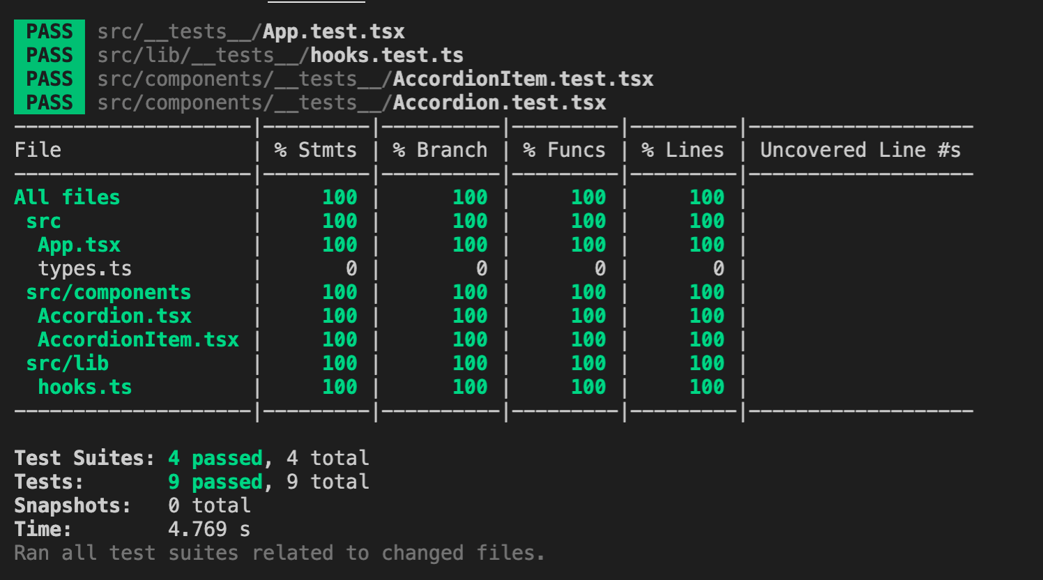
When you run the all the tests again via yarn test --coverage, it will look very satisfying as the terminal would display all green and all 100% covered:
And there you have it! You've just built your own accordion in React and TypeScript with tests! I hope you've learned a lot from this post, especially those who are new to TypeScript and Jest.
In case you need the final code of the accordion as a reference, this is the link to the GitHub repository.
Please don't forget to share this post and just a heads up, I'll be writing more of these "building your own components in React and TypeScript with tests" so if you're interested, you can come back to my blog to check it out once they're published.